“You know, that’s a desk for a fifth grader.”
Two days ago I moved offices from one side of the building to the other. I had a plan for the new space but I didn’t have all the stuff yet. So I set up a small Ikea table in the corner of the room. It’s all I needed to do my job. No big deal, right?
What happened next was a little unexpected, but was an insight into human nature that put a fine point on one of the challenges we run into every day trying to create great products.
In the 48 hours since the move that small room has drawn more attention than anything else in the entire office. Hardly a single person has been able to walk by without stopping to comment.
“You know that’s a desk for a fifth grader.”
“You could us a little more stuff in here.”
“Is that all the furniture they’d give you?”
“Maybe some wall art?”
“Interesting. There’s a lot of potential in here.”
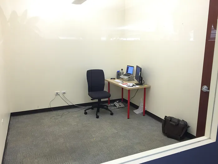
I’ve received literally 30 comments in two days. Given the size of our org, that’s well over a 50% comment rate. Some people have stopped multiple times. One person insisted she get a picture of me (as seen above).
It freaks people out. There is a palpable tension every time someone stops. People clearly think it’s weird, or I’m weird, or whatever. They are uncomfortable. But what’s most interesting is that, inevitably, the conversation steers toward how I’m going to fill the space. What I’m going to add. When I assure people that more stuff is coming they visibly relax. All is right with the world once again.
There is something a little off-putting, but also compelling, about empty space. Honestly, sitting at that little desk in that empty room does make me feel weird. Nature abhors a vacuum and people abhor unused space. We feel a deep need to fill it.
“Interesting. There’s a lot of potential in here.”
We see potential in unused space. Not potential for the sake of it’s emptiness, but potential for what we can put in it. However, great products keep things simple. They solve problems in the clearest and most concise way. The challenge comes in keeping it that way.
A new product starts out with the core features needed to solve the problem. But then that feeling of discomfort starts to creep in. There’s still room for more stuff, why aren’t we filling it? We start to see potential in the empty spaces. So we add features. We extend. We expand. And before we know it our simple, clear product is bloated, overcrowded and confusing. On top of that, you’ll probably find that all those additional features didn’t really add that much value for the user.
Sometimes a tiny desk is all you need to do the job. The more I sit in that empty room, the more comfortable I get.
The more comfortable we can get with the existence of empty space, the more we can understand the significant value it holds. It’s simple, it’s clean, it lacks distraction. There is room to breath in there. One key to great product design is resisting the urge to fill all the empty space. The features you say no to are as important as the ones you say yes to. It feels uncomfortable and it will meet resistance, the urge to fill the space is strong, but if you give your products room to breath your users will thank you.
—
“Perils of Product Design: The Empty Space Trap” was originally published in Medium on March 27, 2015.