This article will help you determine if investing time in building variables within your design system is worthwhile. Project scope significantly influences this decision, so consider the following sections to gauge whether adding variables to your design system will benefit the project.
If your team struggles with design system inconsistencies, either in design or development, leveraging variables can greatly improve workflows across all project roles. Variables now act as a key method for defining styles, strings, numbers, and toggling between dark and light modes within design systems. This evolution offers teams the potential for shared and maintainable value definitions.
Variables in Color Styles
Variables offer more versatility and systemization than static styles. While styles were previously limited to static colors or text sizes, they can now include multiple variables that are adjusted independently.
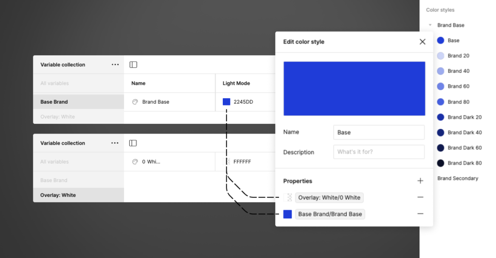
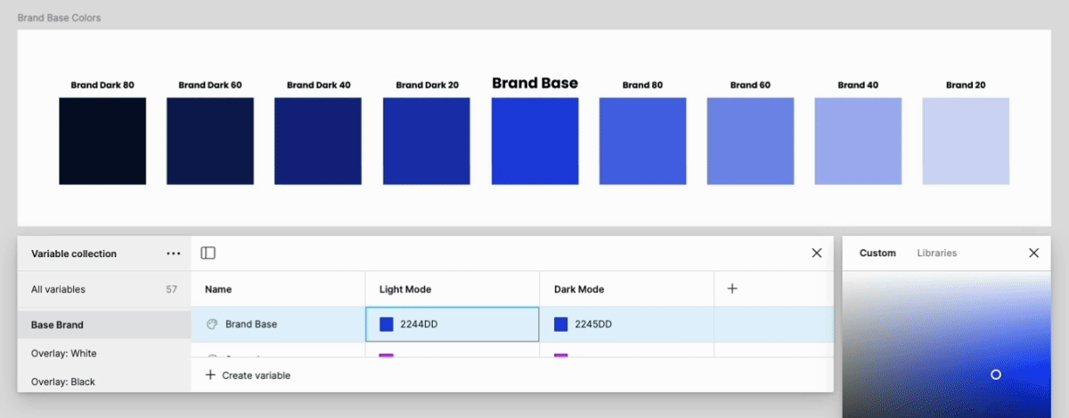
One benefit of styles that contain variables is the ease of creating shades from base colors. Adding a base color with an overlaying black or white transparency can now be done with separate variables and provides the opportunity for quick color adjustments.
For example, our design system includes many shades of a brand color. Adjusting the base brand color automatically updates the corresponding dark and light shades. Previously, this change was less efficient and required multiple manual updates across styles.
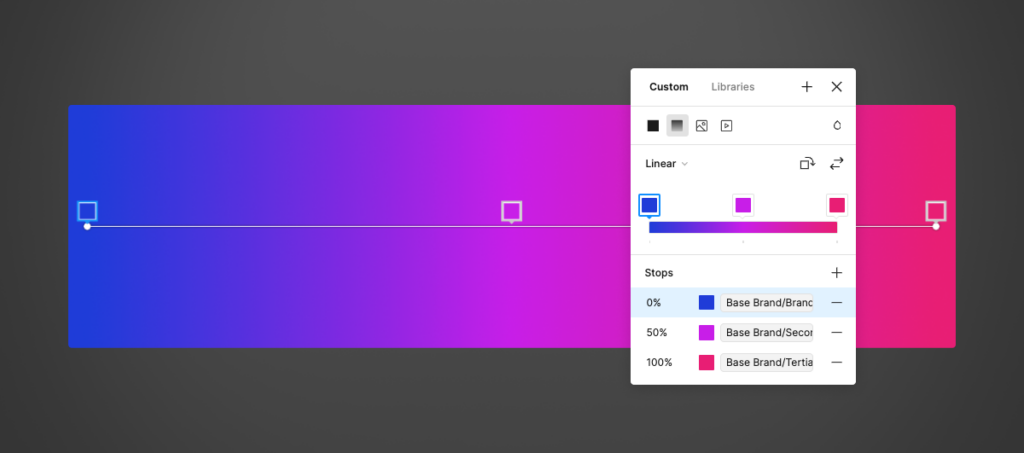
This feature extends to gradient styles, where we can define color stops within the gradient itself. Leveraging variables within styles means that as your brand definition evolves, the tedium of rework decreases.
Variables in Text Styles
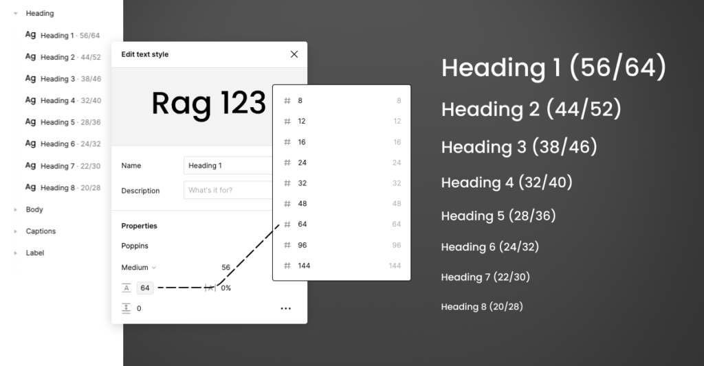
For typographic systems, we can define new variables and apply them to our text styles. Creating typographic variables allows us to define a set of rules that are specific to the use case. Imagine being able to go back and quickly update your typographic variables as new features are added, like calculations: e.g. 16px * 1rem. While calculations are not currently available, working with variables prepares us for increasing automation of tedious workflows.
Variables in Auto Layout
Consider leveraging variables in auto layout. Creating new layout specific variables allows you to quickly define visual rules for padding, spacing and margins. By taking the variable approach you will promote a more thoughtful and consistent application in regards to layout.
Using spacing variables across your design system significantly reduces the need for rework across multiple components and maintains greater design cohesion.
Recap
We hope this overview has shown the benefits of creating consistency across your design system with variables. This information should also help you discuss with stakeholders why investing time in defining design system details reduces the impact of future rework and iteration.
Adapting to new features like variables isn’t specific to Figma. Variables are simply an approach to bridging the gap between designers and developers with defined values. They encourage designers to think responsibly about their designs with the end goal of a maintainable approach.
Remember to stay updated on the latest features to remain ahead of the automation curve, and to consider why these features exist in the first place.
The process of user-centered design focuses a lot of attention on finding the right problem. There are many tools and processes that can be used to suss out user needs and motivations and boil it all down into clearly defined problems to be solved. But with all these tools at our disposal, how can we still end up with less than optimal and often negative outcomes for the people we are supposed to be helping?
The issue is that our obsession with solving the correct problem frequently takes our focus away from an even more important aspect of the project. While we can’t move forward without a defined problem, the way we define success for a project actually carries more weight in the final outcome than problem statements or initial insights from user research.
Raise your hand if this has happened to you: You see an interesting headline, maybe something like, “The 10 Best Vacation Spots in Mexico.” You click the link with the hope of reading through a concise list of locations to help you get some inspiration for your next trip. But that’s not what you get. Instead, you get a page so crowded with ads it’s hard to tell where the article starts and the ads end. On top of that, you don’t even get a list of places. Instead, you get one of the list items (usually the bottom of the list) and you have to click “next” to cycle through the remaining nine items. Each time you click, the page reloads and you have to wade through a new set of ads to see the next item in the list.
This all-too-common experience is not driven by a designer who identified the wrong problem or didn’t have enough insights; it’s driven by a business-centric definition of success.
—
Typically, sites that post articles like “The 10 best vacation spots in [insert exotic location]” survive on advertising money. Each time a page on that site loads, it shows a set of ads. This is called an “impression.” The more impressions a site can generate, the more revenue it collects from the ads. For this kind of business, a key metric is often page views (i.e., how many times the individual pages on a site are loaded in a given timeframe). Every new page view means more ad impressions, which means more revenue. In the eyes of the business, the more page views the site can generate, the better.
This sort of definition of success will shade every part of the decision-making process and can push people to do things that run counter to what we would expect from a user-centered design process.
If a designer creates an article layout that shows all 10 of the Mexican vacation spots in one list on a single page, it would be easy for the reader, but it will only generate a single page view. If instead, the designer creates a layout where the user has to click “next” to see each item in the list, and each click results in a new page being loaded, then someone reading that article generates 10 page views (assuming they click to see all 10 items).
With this change, the designer has now multiplied the performance of their design. For the user the resulting experience is shit, but for the company’s definition of success, the experience is excellent.
Increasing page views (or even “increasing revenue”) focuses solely on the outcomes and needs of the business. This kind of goal is a signal from the company that they don’t care what solution a team comes up with, as long as it moves the numbers. But forcing someone to load 10 pages in order to see all the items in a list is just one way to meet this measure of success. Another way to do it is to write better, more interesting articles with layouts that are more user-friendly and readable so that more people are willing to read and share.
Users have to carry an increasingly heavy burden of the decisions made to meet business-centric metrics.
One of these two design options is easier than the other. (Hint: It’s not the one where you write better content.) And when jobs and performance bonuses are on the line, easier is, well, easier, even if it means less than optimal outcomes for customers. A business-centric definition of success leaves both options on the table. And the onus is frequently on the team to determine the implications of their solutions, the company or team leader having effectively absolved themselves from establishing any guardrails or ethical guidance.
—
Being intentional about the way you word your definition of success can completely change the thought process for your team. In the example of our article site, what if, instead of saying we need to increase page views (or increase revenue), the company said we need to improve article quality? This shift completely flips the conversation, and we move from a business-centric thought process to a user-centered thought process. Unlike increasing page views or revenue, increasing article quality delivers actual value to the user, while still driving the same business outcome. Better articles mean more reads and more shares, which means more page views, which means more revenue.
Many of the same solutions that could be applied to “increase page views” can still be applied to this new, user-centric definition. You might even still measure this in page views, but by changing the words you use, you have actively taken certain solutions off the table and set the parameters for what is acceptable. When the goal is to improve article quality, an unreadable layout with 10 clicks to get to the end of the article no longer makes the cut.
For about seven years, I was head of product and UX for a streaming video subscription service similar to Netflix. As a monthly subscription service, our key business metric was user retention as measured by Lifetime Value (LTV). The more subscribers we could keep month over month, the more revenue we would generate from each customer, increasing their LTV. As such, “improve customer retention” became a driving mantra within the company.
As a team, we tried and suggested lots of different things to meet this definition of success. But one recurring suggestion really stuck out to me. Over the course of seven years, on at least four separate occasions, someone suggested that we remove the cancel button from our website and force customers to call our customer service line in order to cancel. Now, I’m happy to report that I was able to fight that back each time, and we never actually did it. But it kept coming up. And honestly, no one really even wanted to do it, not even the people who were suggesting it. It’s an objectively shitty thing to do. So why did we have to continually waste valuable time debating it?
The issue was that our definition of success—improve customer retention—was business-centric. Again, like the page view example, there are lots of ways you can improve subscriber retention. For a streaming video service you could:
Add new features
Improve existing features
Add new content
Make it harder for someone to cancel
All of those options fit when the goal is to improve customer retention. The business-centric definition leaves it to the team to make the determination. The metric itself doesn’t do any of the heavy lifting to narrow the options or provide ethical guardrails. What if, instead, we had talked about it as “we need to improve customer satisfaction”? Again, this drives toward the same end state. A more satisfied subscriber will stay longer. But it changes the list of available options. Now a team could:
Add new features
Improve existing features
Add new content
Making it harder for someone to cancel no longer makes the cut because it does not match the definition of success. Talking about metrics in a user-centered way sends a clear signal about who and what is most important in what you are doing as a company. You draw an ethical line in the sand signifying that some solutions are off the table no matter how easy or viable they are. This kind of shift can have a ripple effect throughout the entire culture of a company.
Users have to carry an increasingly heavy burden of the decisions made to meet business-centric metrics. The addictive nature of social media, the impact of algorithmically driven echo chambers, the overly aggressive harvesting of our data—these are all propagated and sustained due to business-centric thinking and business-centric definitions of success. Making sure you are solving the right problem is important in a design process, but understanding the impact of the way you define success is even more critical. They say you can’t win the game unless you know how the score is being kept. As a company or a team leader, you have an opportunity to define your scorekeeping in a way that nudges your team toward better outcomes for everyone.
In our drive for speed, we have conditioned ourselves to ignore our most vulnerable users. We design for the happy path, and society pays the price.
The happy path
To create digital products, designers often start by developing a set of scenarios or use cases. These scenarios help determine the features, interactions, and technological infrastructure required in a product.
As an example, let’s think about Facebook. When Mark Zuckerberg was initially creating the social network he may have had a scenario like this in his head:
“An undergrad who wants to share pictures from a party with her friends.”
This is a straightforward statement, but even something as simple as this can help a designer conceptualize the kind of solution required. In the case of a digital product, they can start to imagine the screens that might be needed, the elements on those screens, and so on.
Scenarios come in two basic flavors: happy path and edge cases.
The happy path is a scenario where everything is perfectly aligned for the feature/product to work exactly as the designer intended:
“A benign undergrad goes to a party and takes some inoffensive pictures. She comes home to her computer [remember this is early Facebook] with excellent internet connection, she logs in and uploads her photos with no issues, they go into the database and are disseminated to her friends.”
This is a happy path as we think of it today. As Goldilocks might say, everything is just right.
Many designers start with the happy path because it’s the path of least resistance. It takes the least amount of effort to conceptualize because it removes many of the inconvenient complexities that might exist. That doesn’t necessarily mean it’s easy to design; it’s just comparatively simplified.
The second type of scenario is the edge case. Edge cases deviate from the happy path and, theoretically, they happen less frequently than the happy path. There are two types of edge cases.
The first are technical edge cases, where something goes wrong in the technical flow of the scenario. Maybe there is an error in the photo upload process and it never goes through. Or maybe a user inputs incorrect data in a form field. This is the kind of technical complexity a QA person can test for. Very often a design process will address these kinds of edge cases, or will at least address the major ones. Any decent designer or engineer knows it is important to handle errors and help the user recover from them.
Then there are what I call contextual edge cases: behavioral deviations from the happy path. In our photo upload scenario, a contextual edge case might involve the user uploading a photo that is offensive or pornographic, or uploading a photo of someone else who doesn’t want that photo to live on the site. This kind of edge case can have very significant real-world implications. Unfortunately, these are also the edge cases that rarely get addressed in the design process.
The drive for speed
Today, success in the tech world is defined by speed, scale, and growth — how big can a company get and how fast can it get there. Facebook’s motto is “move fast and break things,” and product teams throughout the industry obsess over how quickly they can “ship features.” VCs even write books about how to run startups in hyperspeed, so you can validate (or invalidate) your idea as quickly as possible and waste the absolute minimum amount of people’s (read: VCs’) time. They call it “blitzscaling.”
The idea of moving quickly has become deeply ingrained in our culture of design, technology, and business.
One of the ways we achieve speed is by focusing on the happy path. Often a team’s strategy is to get the happy path done first as an MVP (minimum viable product) so they can quickly get it out to users before they put more effort into handling edge cases. The problem is that teams rarely come back to handle edge cases. Inevitably, new priorities come up and everyone moves on. What was once considered an MVP is now considered a final product.
Over time, this constant deprioritizing of edge cases conditions designers and engineers to just start ignoring them. Overloaded with work and impossible deadlines, it becomes easier to just pretend edge cases don’t exist.
The impact of the happy path
A few weeks back, a startup called Superhuman released a new “read receipt” feature for their email client product. If I send you an email using Superhuman and you open it in whatever email client you use (Gmail, Yahoo, etc.), the read receipt feature sends me a notification telling me you opened it. Straightforward enough. But there were two twists with Superhuman’s implementation. First, the read receipt didn’t just tell me that you opened the message, it also gave me location data of where you were when you opened it. Yikes. Second, you, the recipient, had no way of opting out of the feature. Regardless of the settings in your email client, you would always send me a read receipt. Double yikes.
This kind of feature has huge implications for victims of stalking, abuse, and so many other negative scenarios. Unsurprisingly, there was an outcry, and Superhuman modified the feature. But the feature should have never left the gate in the first place. When the controversy happened, Superhuman wrote a blog post and the CEO tweeted an apology:
3/ I am so very sorry for how our read status feature made folks feel. We did not imagine the potential for misuse. Now we are learning and changing.
If this tweet is to be believed, it seems the idea that there could be deviations from the happy path didn’t even come up in the design process. It wasn’t even on their radar. Our drive for speed has conditioned us to design as if edge cases don’t exist. It’s not that we just decide not to solve them, it’s that we don’t even imagine them. These are practices handed down across companies and design schools. Many of us are so well trained at this point, slowing down doesn’t even guarantee a better outcome; ignoring edge cases is subconsciously baked into our process.
As companies push for scale and growth at breakneck pace they are weaponizing technology against groups that fall outside of their defined happy path.
We’re watching the cumulative impact of this play out on the web every day. Massive platforms like YouTube, Facebook, and Twitter were all architected with a best-case-scenario, happy-path mentality — a benign user sharing what they had for lunch or posting a video of their cat. The edge cases of abuse, harassment, and misinformation were all but ignored until they reached a scale where public scrutiny made it impossible to continue ignoring them, but by then it was too late. Addressing edge cases is not in the DNA of these companies. When you have spent 15 years fusing your business model to the happy path, your processes, organizational structures, and mentality are not geared to think beyond it. So these platforms are either slow to respond or completely incapable of it.
Happy path design is not human-centered, it is business-centered. It’s good for businesses because it allows them to move fast. But speed provides no benefit to the user. As companies push for scale and growth at breakneck pace they are systematically weaponizing technology against groups and use cases that fall outside of their defined happy path.
Who is in the happy path?
Part of the justification for happy path design is that edge cases are rare. In some cases, they might only affect 1% of a product’s users. Mike Monteiro points out the fallacy in this thinking in his book Ruined by Design:
Facebook claims to have two billion users…1% of two billion is twenty million. When you’re moving fast and breaking things 1% is well within the acceptable breaking point for rolling out new work. Yet it contains twenty million people. They have names. They have faces. Technology companies call these people edge cases, because they live at the margins. They are, by definition, the marginalized.
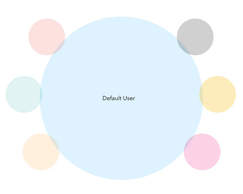
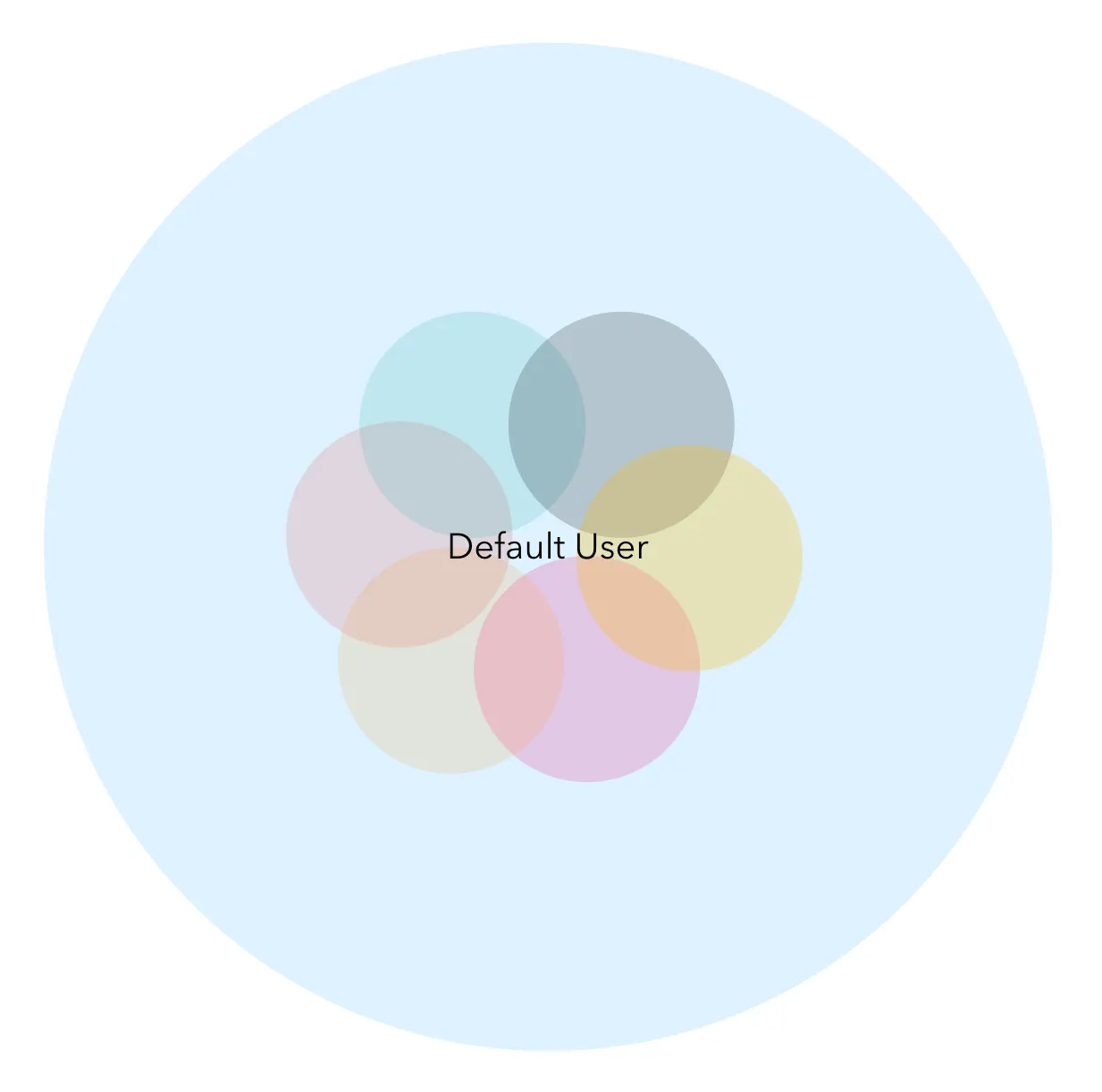
On top of this, the actual process of happy path design often involves having a default user persona who fits nicely into your complication-free use cases. This compounds the happy path problem because it means we are not only looking at a contrived view of the scenario itself but also at an artificially small slice of potential users.
After all, the happy path is free of risk and complication. By definition, the people with the least risk and complication are the least vulnerable users of a product.
Everyone else, as Monteiro pointed out, sit at the margins and are given almost no thought until after the damage is done and there is some kind of outcry.
More often than not, the humans who sit on the margins of our products are the same humans who sit on the margins of society.
When Superhuman was designing their read receipt feature, they weren’t designing it for people at risk of stalking and abuse (statistically, most likely women). They were designing it for their default user, who I would assume is some VC (statistically, most likely a man) sending off an urgent email to a founder (statistically, also most likely a man).
I’m making an assumption here — maybe they include women personas in their design process — but here is the real rub: Their personas are irrelevant. Despite what we say about having empathy in design, the default user is always ourselves. The idea of designer empathy is the biggest trick we’ve ever pulled on ourselves. Unless the person you are designing for shares your life experience, you cannot put yourself in their shoes in any meaningful way. Uncovering consumer insights is not the same as empathy, and human-centered design is not a magic shield against bias.
The humans who sit on the margins of our products are the same humans who sit on the margins of society.
A quick perusal of the Superhuman website shows that their product and engineering team is 83% dudes. Maybe someone pushed back on the read receipt feature, maybe they didn’t. But it’s almost guaranteed that a dude made the final decision. By and large, dudes don’t walk around afraid of abuse or stalking. It is, by and large, not our life experience.
“We did not imagine the potential for misuse.”
Designing for speed has trained us to ignore edge cases, and the overwhelming prevalence of homogenous teams made up of the least vulnerable among us (read: dudes) has conditioned us to center their life experience in our design process.
The canary in the coal mine
Miners used to take canaries with them into the coal mine. The idea was that the canaries were more vulnerable to the harmful gases that can build up in a mine. If the canary was fine, everyone knew things were safe. If something happened to the canary, it was a sign for everyone to get out.
This is a robust system. If you design for the well-being of the most vulnerable, you design for the well-being of everyone. We don’t design like that today. Today we design for the least vulnerable and then pretend nothing bad ever happens in a coal mine.
The breadth of the scenarios we consider determines how resilient our products are to deviations in the intended behavior. Today we are building massive platforms, with massive reach and impact, yet they are massively fragile. If we are honest with ourselves, these platforms represent a failure of design. Their success hinges on an intentional disregard for human complexity, and society pays the price for it.
The real happy path is not the path of least resistance; it’s the path of most resilience.
We have to redefine what a happy path is and relearn how to embrace complexity. In our Facebook photo-sharing example, what if our initial scenario looked something like this instead:
“A guy shares a compromising photo of a woman with his friends, and the woman is able to remove it from the site.”
This is what a happy path should be. It gets us to the same place as the original statement, and we still have to design and build the interactions required to let that guy share his photo. But it also does something crucial: It centers the most vulnerable user over the least vulnerable. It bakes the idea of misuse and negative outcomes into the core of our thought process and fuses it into the DNA of the organization.
—
The real happy path is not the path of least resistance; it’s the path of most resilience.
A lot of entrepreneurs talk about “first principles” as a way to identify their assumptions and guide their product development. While it may never have been explicitly stated, the inherent bias in our product development approach has meant that our underlying first principle has been to ignore human complexity. Redefining the happy path means establishing resiliency as our underlying first principle and moves the vulnerable to the center of our thinking. It forces us to embrace complexity and understand that when we design for the vulnerable, we design for everyone. No more half solutions.
Would this approach slow teams down? Maybe a bit, but we are not talking about creating “perfect solutions,” just slightly more robust ones that center someone other than your average white guy. I would also argue that if the success or failure of your company is determined by a few extra days/weeks of development time, there are bigger problems going on.
We will never be able to come up with scenarios for every possible edge case; it’s impossible and that’s not what I’m suggesting. We also don’t need to. By starting with even one, we fundamentally change the foundation of our thought process. This kind of structural shift can enable individuals and organizations to cultivate the competencies and capabilities required to not only flag potential future issues, but to bring real solutions to the table when they inevitably emerge. That’s a happier path for everyone.
In March of 2008, salmonella infiltrated the public water system of the town of Alamosa in southern Colorado. The resulting disease outbreak infected an estimated 1,300 people, over 14% of the town’s population. Of those infected, one person died and 20 more were hospitalized. The Alamosa outbreak was the second-largest water-borne illness outbreak in the United States that decade.
Though teams worked as quickly as they could to sanitize the water system, the people of Alamosa were unable to use the water for weeks. While some people were able to get water from friends who had wells or were otherwise not connected to the system, most had no options. Without undertaking the major operation to deliver and distribute bottled water for drinking and cooking, it would have been extremely difficult for the town to weather the outbreak.
Before I became a designer, I spent five years as a public health emergency planner. I planned for and responded to disease outbreaks, tornados, and pandemics. When the Alamosa outbreak occurred, I was part of a nine-person team dispatched to help manage the first week of the incident. What played out in Alamosa was not unique. The story is a microcosm of a larger issue that carries through much of what we humans create.
When we design systems and products, we do it based on a set of defined scenarios, or use cases. These scenarios help us define how the thing we’re designing will be used, so we can determine the required features, interactions, materials, capacity, and so on. The scope of those scenarios is a key determinant of how tolerant our design will be to changes in the environment and user behavior.
The water system in Alamosa was built on a deep well aquifer, a water source thought to be protected from contamination because of its depth. The system was designed to operate as a closed system devoid of harmful pathogens, and in 1974 Alamosa was granted a waiver to not include chlorination as a disinfecting step in the water treatment process. When the scenario changed and the closed system was breached, the design lacked the resilience to handle it; a chlorination step would have all but eliminated the risk. Alamosa has since added chlorination to its system, but only after the city had to reckon with the fallout of a fragile design.
—
Designing for the happy path
We don’t like to think about worst-case scenarios. Hell, we don’t even like to think about not-so-great-case scenarios. Instead, we design and build systems and products that work when conditions are just right. In design, this is sometimes referred to as the “happy path.” We design for the happy path first and then, if time allows, we go back later to look at other not-so-happy paths, or “edge cases.” But in a world of “move fast and break things,” time rarely allows for us to go back and look at the edge cases. If we do get time, we address those edge cases as an afterthought.
The impact of happy-path design isn’t limited to major infrastructure: We’re watching it play out every day. The inability of sites like YouTube, Twitter, and Facebook to tackle fake news and curb rampant harassment is a direct result of happy-path thinking. Those systems were conceived and architected with the best-case scenario in mind — a benign user posting about what they ate for lunch or sharing videos of their cat. These platforms have little to no resilience in the face of behaviors that diverge from that scenario, which means that if and when the system breaks down and people use it with ill intentions, these companies will be slow to respond or possibly incapable of recovering, as they try to react to a circumstance they’ve hardly considered.
The problem is that in the real world, things always go wrong. Reality is not a best-case scenario, it’s chaotic and messy.
Their goal is to move fast, and addressing edge cases is not fast. This isn’t limited to social media companies. In many industries, companies fail to prioritize edge cases, and this results in fragile products that struggle to recover when things go wrong.
The problem is that in the real world, things always go wrong. Reality is not a best-case scenario, it’s chaotic and messy, and we are moving toward a time in history that has the potential to become more and more so.
The next century could deliver an unprecedented level of change to our existence on earth. We’ve lost 50% of the world’s biodiversity in the last 40 years. We’re seeing increases in many forms of extreme weather. The climate is warming and all manner of things are changing.
We can clutch our pearls all day and say that climate change is a natural process and it’s not our fault, but that point is irrelevant. Man-made or not, change is already happening, and we have not designed a world that can handle it. So far we’ve proven ourselves unwilling to even try to stop it, so our ability to survive and thrive in the 21st century may be predicated more on our level of resilience in the face of it. This means we have to change the way we think about everything we create.
—
Designing for resilience
Designing for resilience isn’t just about helping people prepare for disasters; it’s about shifting our cultural mindset to change some of the ways we think about business strategy and collaboration, and this is not limited to those designing major infrastructure. Shifting culture means applying these concepts across the spectrum of design disciplines and beyond, weaving them into everything from seemingly minor product-level decisions, to major policies and systems on a societal level.
Here are some places to start.
Designing for the edge cases
By “moving fast” and ignoring edge cases, we are systematically weaponizing technology against groups and use cases that fall outside of our defined happy path. Facial recognition software, for example, still has trouble recognizing black faces. And that’s just a start — I mean, we barely take the time to design for people who are color blind. Across the web, algorithms and interfaces packed with bias and designed on best-case thinking sit like landmines just waiting to be stepped on.
In an effort to be agile and keep up with the speed of our broken tech culture, we are failing to do our due diligence as designers, and the consequences of that failure are growing. Resilient products that can successfully operate outside of the best-case scenario are less fragile, better-designed products. By committing to consider a wider set of scenarios, we make our solutions more robust and more valuable. As Cathy O’Neil puts it in her book, Weapons of Math Destruction:
“To create a model, then, we make choices about what’s important enough to include, simplifying the world into a toy version that can be easily understood and from which we can infer important facts and actions. We expect it to handle only one job and accept that it will occasionally act like a clueless machine, one with enormous blind spots.“
We can’t continue to willingly operate with enormous blind spots. The first step toward building a more resilient world is to dramatically widen our design process to account for the unhappy paths.
Future-focused design
When we design something new, most often we design it for the world of today: today’s population, today’s market demand, today’s resource availability, today’s climate. We talk to users about their current challenges, and we look at recent data to decide what we should do next. Being present-focused is an outgrowth of happy-path design. Generating projections of future needs and conditions can be time-consuming, and decisions based on projections can be harder to justify. Building on current conditions is much faster and more straightforward. The problem is that today is not tomorrow, and designing for current conditions makes our solutions less resilient to future changes. This is especially critical when we think about the impacts of climate change.
Take road construction. Our current decision-making process for road construction is still based on historical weather data from the last century. Certain grades of asphalt are made to withstand certain temperatures, and many new roads are being built to withstand cold temperatures that are increasingly rare, instead of being built to withstand the higher temperatures that are becoming the norm. The result is more road damage, unnecessary maintenance costs in the billions of dollars, and even full-on melting. We also see this in the design of plastic products, many of which are not built to tolerate higher temperatures. Items like plastic mailboxes and trash cans have melted in the face of heat waves in Arizona.
We’ve become better than ever at forecasting the future, especially in climatology, but we haven’t shifted our decision-making processes to respond to those forecasts. We need to take a longer view of what we are creating: Based on what we know about the future, how will our solution work when conditions change?
Distributed systems and interoperability
Our model of business today is monopolization. We strive to dominate markets by pushing out the competition and maximizing market share. The drive for monopoly motivates companies to try to build “competitive moats” around their businesses, in the form of centralization or proprietary products. While this has the potential to drive financial success for companies, monopolization creates systemic fragility.
Proprietary products
I have a drawer full of old iPhone charger cables. I haven’t thrown them away yet, but they’re useless because they don’t work with my new phone. I also have a box of random chargers and cables that belong to a long list of devices that I may or may not even own anymore. These have also become useless. Then there’s my drawer of dongles. If you’ve ever had to connect your computer to a TV or some other external device, you’ve inevitably had to play the dongle game, especially if you have a Mac. Apple dongles were the top-selling Apple product at BestBuy stores from 2016 to 2018.
Being able to swap parts and pieces and communicate across devices makes it much easier for a person to handle scenarios that don’t follow the happy path.
While some of this detritus is created by the inevitable evolution of technology, much of it is the result of the competitive moats of proprietary tech. We’ve made it incredibly difficult for our various technologies to connect and communicate, and that’s a symptom of a fragile system.
Being able to swap parts and pieces, share cables, and communicate across devices makes it much easier for a person to handle scenarios that don’t follow the happy path, like when they forget their charger or have to present unexpectedly at a meeting or need to share a file between devices. Interoperability creates a resilient system and allows for easy recovery from suboptimal scenarios.
To achieve interoperability, we have to move away from leveraging components for proprietary value and instead focus on designing for and adopting open technology standards. This can feel like a business risk, but it actually has the potential to create significantly more value than any competitive moat could. You are reading this article right now using an accepted set of open technology standards that drive the internet. This standardization has created a level of interoperability that has unlocked more value than almost any other technology in human history and made the web one of our most resilient systems. Where would we be if every company had its own proprietary web?
Centralization
As businesses grow, they work to align products, systems, and strategy to eliminate (or acquire) competition and centralize the market around their offerings. This drives value, but it also creates significant failure points. Food production is an excellent example.
As we have moved away from distributed, local food production, we have centralized the system around a shrinking number of multinational companies who source, produce, and distribute most of the things we eat. This system has allowed us to achieve nearly ubiquitous availability of food products — you can find the same foods everywhere at almost any time of the year. But this system is also rife with fragility.
The flow of food is so dependent on centralized distribution networks that changing conditions at any point in the system can have major ripple effects across the globe, and increasingly, cities and towns have little to no ability to compensate. Most grocery stores only stock enough food for a week of demand. If production or distribution is disrupted, a town or city can quickly run out. This is why we have to distribute emergency food supplies during emergencies.
Food is just one example. This sort of centralization exists in fuel distribution, power generation, telecommunications, and so on. In a world where changes to the climate have both short- and long-term potential to dramatically impact these and other systems, we have to start questioning the validity of the monopoly model. How can we build businesses and design systems that drive economic value but do so in a robust way that builds resilience and can cope with change?
—
Breaking away from fragile design requires a shift in thinking. It means spending more time considering less-than-optimal scenarios and putting in the effort to address them. If we do this, we’ll create more resilient, accessible, and ultimately more valuable design solutions. In a world where the only constant is change, we’re selling ourselves short by staying on the happy path.
What is storytelling? More and more, in design, we’re told that we need to be great storytellers. But what does storytelling actually mean, and more importantly what does it mean in the context of design?
Webster has a few definitions for story: “an account of incidents or events”, “a statement regarding the facts pertinent to a situation in question”, or “a fictional narrative shorter than a novel.”
For many, when the term “storytelling” is thrown around, it’s that last definition that frames its meaning, “a fictional narrative shorter than a novel.” But that definition carries with it a significant amount of baggage and deeper cultural meaning, which I believe drives anxiety and confusion about what storytelling in design is actually supposed to be.
A good narrative, fictional or not, has a set structure and key elements that carry a person through it. This includes an exposition (beginning), conflict, rising action, climax and denouement (ending), as well as characters, settings, plot points, etc. With the pressure for all of us to be storytellers, we find ourselves contorting our processes and artifacts to fit each of those elements. Personas become characters, flows take on narrative structures and so on. In many cases, the comparisons are loose at best and the contortions quickly feel like an overreach. Further, if the majority of the story structure we are creating is filled by the steps in our design process then whatever story we are telling is a story we are telling ourselves, not a story we are telling our customers (unless you publish your personas and user journeys as part of your product releases).
However, this doesn’t mean that we aren’t storytellers. But, foundationally, I think we are zeroing in on the wrong aspect of what makes a good story. A narrative structure is just a mechanism, the how, it is not the end result. What we are really talking about when we say we need to be great storytellers is that we need to be able to elicit emotion. The end result of a great story is that a person feels an emotion, but emotion can also be felt without telling a story.
With this in mind, there are two key areas where emotion can play a critical role in delivering great design.
I. Emotion in the things we create
We want people to love our products and enjoy their experience. These goals are actually another reason the narrative metaphor breaks down. A truly compelling narrative creates tension, often making the person experiencing it feel uncomfortable, sad, or concerned. These are not typically feelings you want your product to elicit. If we are actually telling stories in our products, then almost all of them are going to be boring, contrived fluff pieces with no real conflict. Luckily we don’t have to worry about that, because we are not telling stories. We’re just trying to make people feel good.
To accomplish this, we need to create an emotional narrative, which is very different from a literal narrative. An emotional narrative is just about tone, it’s not about story arch. Copy, visuals, and interactions can all connect to convey and elicit positive emotion throughout an experience, with no tension, no conflict, no characters, and no plot points.
Ultimately, your product may become part of a person’s story, as in “I lost my keys last night and I had to call an Uber to get home.” In this case, Uber is a plot point in the story, but it is not the story. As a product designer, your goal is not to write that narrative, your goal is to ensure that when your product becomes part of that narrative it plays a positive role.
A note on process. I’ve seen a number of discussions where the design process is framed as storytelling using user scenarios, personas, etc, as narrative elements. Something similar to the Uber example above. Developing scenarios and use cases that place the product into a person’s story. While there can be validity to this approach, it is important that it is done carefully.
Developing UX deliverables like personas, user journeys and scenarios is already a deeply fraught process. It is so easy to slip into biased, best-case scenario thinking. This can result in artifacts that conveniently portray target customers and use-cases that perfectly validate the vision you already had for the product, but which might not actually exist in reality.
The further you push yourself into “storytelling” mode the more likely you are to end up in the realm of fiction because you feel compelled to create a narrative. Further, it’s also easy, when taking this approach, to build the narrative around the product, as opposed to building it around the person. It’s a fine line and sometimes this happens unconsciously. When this happens, it can cause you to overestimate the role a product will play in a person’s life, building false justification for extra features and creating unrealistic expectations for engagement.
I have found that it can be more beneficial to strip a lot of narrative storytelling out of UX deliverables. It helps keep them objective and focuses the team on the critical insights and information. Those insights can sometimes get lost when you add a bunch of extra, non-critical details for the sake of building a story. So many deliverables are full of useless data points designed to make the persona or scenario “feel real”, but that do nothing to actually help make design decisions. These are just distractions.
II. Emotion in the way you present your work
The skills required to effectively present and “sell” your work are arguably the most important skills you can build as a designer.
In their book, The Leadership Challenge, authors Kouzes and Posner lay out five Practices of Exemplary Leadership. One of the most critical (and challenging) is to “Inspire a Shared Vision.” This is about envisioning the future and enlisting others into that vision.
We focus heavily on building the hard skills of design, with a feeling that usable and aesthetically pleasing design is like a magnet that will just draw people in with awe and wonder. This, of course, is not the case. If you can’t get your stakeholders on board with your vision, you’re design skills mean very little. I’ve watched countless great ideas and excellent designs die because the designer couldn’t get anyone to care, and I’ve had my own ideas killed because I failed in that task as well.
Part of effectively presenting work is in the way you build a “story” around it, but here again, this isn’t about traditional narrative structure. In this case, there are different elements to consider:
Setting Context (tell me why this is important)
Showing the Solution (why does this solve the problem)
Defining Success (how are we going to know if this works)
Setting Context: This is the most critical component. No one will sign onto a vision if they don’t understand why it matters. This isn’t about communicating why the work is important to you, this is about communicating why the work should be important to the audience. This is an important distinction because often we approach the idea of setting context by walking people through our process. What research we did, how we did it, what we found, our personas, our flows and so on. These are the important things to us, these are not important things to most other people. The key is to use the information you’ve gained from the design process to get others excited about the project. Why should they care? Answering this question means you have to have an understanding of the many roles within the company, the individuals who fill them and be able to conceptualize your work through the lens of their goals and needs.
When I was head of UX in my previous job, my team and I decided that we needed to build a new app to solve a specific challenge. We couldn’t do this on our own so we had to sell the idea across the company. This meant enlisting not just the design team, but the leadership and staff in engineering, marketing, finance, and content, not to mention the CEO.
The context required for each of these groups was very different. Enlisting the marketing team meant helping them understand not only the value for the user and business but why it would enhance their strategy. The content team had to understand that the effort to create new content for the experience (in this case videos) would be time well spent. Finance needed to understand the business case and the expected resource requirements. And so on.
This wasn’t just one big meeting with key stakeholders, this was many individual and small team meetings which allowed us to get the project done.
In setting context, as in most things, less is more. Your goal is to determine the minimum information needed to get someone on board and keep it at that. Just like having personas with too much information, too much context distracts from the important points. Sometimes we feel like we need to show everything we’ve done to prove that we’ve been working hard or to get recognition for the amount of effort we’ve put in. The goal is not to show your work, the goal is to enlist people into your vision.
Finally, it is important to remember that context requires repetition. People are flooded with new priorities every day. To keep an organization focused and on the same page you need to constantly remind people why a project is important. Every check-in at each stage of a project should include at least a brief reminder of the context at the outset. This even includes one-on-one design reviews with the person who assigned you the work. It may feel redundant but it frames all conversations around what’s important.
Showing the Solution: Once the context is set you can show the solution. Depending on the stage of the work this could be anything from a conceptual discussion to high fidelity designs.
The key is to always anchor your work back to the context you set. Reinforce why this is solving the problem. You want the audience to not only feel like the work is important but that what they are about to help you create is heading in the right direction.
The level of detail here is relative to the audience and goal of the meeting. A functional design review with engineering is probably going to require a significantly higher level of detail than a walkthrough for the executive team. Understand your context, both through the lens of goals and individual expectations. This is not one size fits all.
Defining Success: In terms of importance, defining success is a close second to setting context. Defining success does two things in building a vision and eliciting emotion. First, it allows people to conceptualize and take ownership of what is important in a project. You can’t win the game unless you know how the score is being kept. Being clear on the definition of success empowers each team to determine the best way to win.
Secondly, it codifies a shared goal across teams. This is what we are trying to accomplish and here is how we will all measure it together. Setting this expectation and getting buy-in on the definition means that if the project succeeds everyone gets to celebrate and if it fails everyone gets to work together to determine why and figure out next steps. Without defining success everyone is just left to wonder if the effort was worth it.
How You Show Up
The final and most important piece to effectively presenting your work is in how you show up. Your level of enthusiasm for the work will set the tone for the entire discussion. This doesn’t mean you need to do an over the top musical number but it does mean that you need to be intentional in your approach. Everything from body language to the words you use and the way you deliver them plays into the story others create about your work.
This isn’t always easy, sometimes you aren’t excited about the work, or you’re having a bad day. It’s important to remember that your work represents you and you represent your work. Finding a well of energy, even in those low times, is important in putting yourself and your work in the best possible light.
This doesn’t mean you need to sugar coat things or always be overly positive. If you aren’t happy with how something is turning out or are having a bout of imposter syndrome you can be honest about that, but be intentional about the way you approach it. For example, you could say — “I’m really not happy with this. I wasn’t sure what to do and I don’t love where I landed.” This primes whoever you’re meeting with to feel like the work is going to be bad, and that progress isn’t being made. A negative expectation has been set for the entire discussion. Versus something like — “I’ve made some progress, but I still have a lot of questions I’m working through. I’m really interested to get your feedback and ideas.” This communicates the same thing but the tonal shift tells a completely different story. The emotion you are eliciting is positive instead of negative. Now everyone is going into the discussion feeling like progress has been made, and though there are still things to figure out, this a chance to do it together.
—
In design, story is all about emotion. Our goal is not to build characters and plot, it is to convey and elicit feelings. This can fold into your design practice through clarity, understanding, and intention. If you are clear on the emotions you are trying to drive, understand the people who will engage with your work and are intentional with your approach, the story writes itself.
Late last year, I wrote a piece titled “Design Won’t Save the World.” It focused on the limits of human-centered design and its failure to impact the big problems we face. The morning the piece was published, my wife sat in our living room reading through it. When she finished she said, “we need bee-centered design.” Since that moment I’ve been thinking about what that would mean.
Wikipedia defines human-centered design (HCD) as “a design and management framework that develops solutions to problems by involving the human perspective in all steps of the problem-solving process.”
Hasn’t our entire existence been about involving the human perspective in all steps of the process? I mean, at one point we literally believed that we were the center of the universe. Empirically we’ve figured out that we’re not the center of everything but practically, we pretty much still carry on as if we are. We are very aware of the vast and powerful interplay between the parts and pieces that surround us, but we continue to see the world as one big show unfolding in service to us. When you get right down to it, human-centered design is just an extension of this belief in both name and execution.
Humans have a lot of problems that need solving — and we should try to solve those problems. But humans don’t exist in isolation; we are but one very small piece in a very large puzzle. While centering the human perspective can help foster more humane design outcomes, it also perpetuates myopic navel-gazing.
By centering on the human perspective, we also center our narrow definition of success.
When we observe a problem that impacts people, our process dictates that we solve it. Very often, these solutions are developed in isolation, exclusively from the human perspective. This creates a solutions-at-all costs mentality in which we often ignore any risk of broader impacts, rarely asking ourselves if the problem should even be solved in the first place. This inward-looking approach leads to a lot of human-centered solutions — but it also leads to a lot of collateral damage to the larger systems around us.
By centering the human perspective, we also center our narrow definition of success. We believe that business metrics and economic growth are the end-all, be-all of human progress. But when we infuse that belief into all steps of the problem-solving process, it becomes the frame through which we view all outcomes. In many cases, a solution is not deemed successful unless it carries a financial upside. (This doesn’t have to mean actual revenue; it can simply mean shareholder value, as we see with many web companies.) Whether the solution solves the original problem or not is almost entirely irrelevant. This prioritization of profits over progress puts a ceiling on the amount of real, human value we can actually deliver. It also papers over any resulting collateral damage.
While centering the human perspective has allowed us to make important gains, it doesn’t scale. In an interdependent system, continually over-prioritizing the needs and desires of a single component will eventually cause the entire system to collapse.
It’s time for us to broaden our perspective. We need to start looking beyond the ends of our own noses.
What is bee-centered design?
So, what does bee-centered design really look like? I’ve realized that it’s not necessarily a literal concept. We don’t gain anything by actually putting bees at the center of our decision-making processes, or by spending lots of time creating solutions to problems that the bees didn’t even know they had. Rather, it’s about shifting our mindset to open up a much-needed new perspective for the things we create.
The “canary in the coal mine” mentality
The scale of our impact on the environment is enormous. In our current design paradigm, we largely assess that impact based on short-term outcomes for ourselves. If something doesn’t kill us immediately, we’ll give it a thumbs-up. But we are the strongest link in the chain and in an interdependent system, the chain is only as strong as its weakest link. Unfortunately, our approach to design has been knocking off weak links left and right.
So far, we have largely shielded ourselves from this downside with our technical resilience. But there is a limit to what we can withstand.
Bees are a sentinel species. They are more fragile and susceptible to environmental changes than species further up the food chain, and their health is an early indicator of impending ecological issues. If our design process shifted to center them, or to focus on other weaker links, we would have to consider the impacts of our actions beyond our immediate health and safety. This small change could mean a complete shift in our tolerance for risk, and in our patterns of creation and consumption.
This principle isn’t just about sustainability; it’s also about the quality of our design solutions. In a previous career, I was a health inspector. The regulations I used to enforce food safety were developed based upon risk tolerances aimed to protect the most vulnerable among us: young children, the elderly, and the immunocompromised. While this system created a more stringent set of rules, it also made the rules significantly more effective. A standard set to protect a baby will almost always protect a healthy adult.
Nothing we create exists in isolation; it all lives within the overall natural system. If we architect our solutions with tolerances that support the more vulnerable aspects of that system, we’ll actually craft a more effective solution. If we design for the health of the canary in the coal mine, we will also be designing for the health of the miner.
A common goal
Bees work in service of their hives. The hive system delivers maximum value because everyone feeds into it and moves in the same direction. The key to the hive’s effectiveness is that every bee within it has a clear view of where they are going. Humans don’t have that; on the whole, we don’t have shared goals. The closest thing we have is the profit motive (and, I guess, basic survival).
Where are we going and to what end? Are we just making shit for the hell of it? Do we want to pile up money? Solve all human problems? Fill every possible niche with a product? These are obviously big questions but they aren’t questions that our existing design frameworks even remotely try to address.
We’re trained to ask questions — but why don’t we question the validity and value of our obsession with solving problems that affect only us?
Instead, our current frameworks root us in processes and problems. Design thinking, for example, is rooted in “empathy, optimism, iteration, creative confidence, experimentation, and an embrace of ambiguity and failure.” This is all about process, not outcomes. It provides a playbook for how to find problems and steps for how to develop solutions, but it doesn’t guide the outcomes for those solutions. It doesn’t get us all moving in the same direction.
What if the core of our design framework was rooted in a set of universal outcomes? What if we had a common set of goals to pull toward, regardless of what product we’re designing or what industry we’re working in? These goals could be built around things like empowerment, inclusivity, sustainability, equity, and opportunity. They could become a base filter through which we evaluate all of our designs.
Having collective goals would not negate the need for process altogether. Instead, it would ground that process in a shared ethos, amplifying the power of all of our efforts in a common direction rather than pushing each of us to grasp in isolation for something greater.
Widening our view of the world
Bee-centered design would also, quite simply, widen our view of the world. It would mean taking a moment to get out of our human bubble and look around. We’ve told ourselves so many stories about the way things are supposed to be; those stories play on autopilot every time we create something. We’re trained to ask questions — but why don’t we question the validity and value of our obsession with solving problems that affect only us?
Why do our companies need to become monopolies in order to win? Why do our products need to maximize engagement? Why is convincing people to upgrade every 12 months a good thing?
Does every product deserve to exist? Does every problem need to be solved?
Human-centered thinking keeps us locked in our human-centered bubble. We need to break out.
When I was in design school, this statement filled me with incredible energy and pride. I felt it in my core. How could I not? Over the last few decades, design — and design thinking — has ascended to the point of being routinely viewed as one of the differentiators for companies and products.
Behind this ascension lies design’s anointed operating system: human-centered design.
The fundamental idea behind human-centered design is that, to find the best solution, designers need to develop an empathetic understanding of the people they are designing for.
Designers do this through user interviews, contextual observations (watching users go about their business in their “normal” life), and a number of other tools that help designers put themselves in users’ shoes. Once you can paint an empathetic picture of a user’s needs, the next step in the process is to identify a few key insights and use those to create a solution.
One famous example is the development of the Swiffer mop. Designers, tasked with improving the process of housecleaning, observed customers cleaning their homes. A key insight was that time was critical. Cleaning often cut into time for other activities, and any time savings would be a boon. Mopping was identified as an especially time-consuming part of cleaning, with multiple steps and multiple pieces of equipment, not to mention waiting for the floor to dry. So designers created a “dry mop” (the Swiffer) that simplified the process and saved time. It was a huge commercial success.
Straightforward enough.
And the process works. Countless products and services that drive our daily lives were either born from this process or dramatically improved by it. Smartphones and many of their apps, social media services like Instagram and Twitter. The darlings of the sharing economy — Uber, Lyft, and Airbnb. Not to mention a litany of physical products.
The way the world works and the way we work in it are fundamentally different today than they were even a decade ago. In large part, this is due to the process of human-centered design.
So, we as designers puff out our chests and carry our heads high knowing that we have the power to change the world.
But, if you step back for a moment, you start to see a problem: We’ve been designing the world, real hard, for decades now and we haven’t made a dent in a single real problem.
What do I mean by “real problem”?
I mean real problems. The big ones. The kind that shake us to the core of our humanity and threaten our long-term viability.
Hunger. Climate change. Poverty. Income inequality. Illiteracy. Bigotry. Discrimination. Environmental degradation. The list goes on.
Right now, there are people in the richest country on Earth who are starving. People who can’t access or afford health care. People who are homeless. That’s the richest country.
Right now, our oceans are choking to death from plastics. Our atmosphere is choking to death from CO2, and we have effectively lost 50 percent of the Earth’s biodiversity.
Guess what: Design hasn’t fixed any of it.
Not even the slightest bit.
And, unfortunately, design won’t fix any of it, because our operating system won’t allow it.
The Problem with Human-Centered Design
Big problems, those that threaten our existence or the stability of our society, are systemic. They coarse through the veins of the entire system. Their causes are widespread and varied, and the people involved represent almost every segment of society.
These kinds of problems are multifaceted. They do not have a silver bullet. There is no “ah-ha” insight hiding out there that will suddenly help us solve the problem and see the light.
Instead, solving these kinds of systemic problems is like trying to contain a wildfire. While you’re working to fight one side of it, the other side has just burned another 50 square miles. You can’t hope to make progress by chipping away at one piece of the problem while ignoring the others.
Eventually, like a wildfire, you try to mitigate as much damage as possible until the weather shifts and a rainstorm comes along, providing a truly systemic solution. A solution that addresses the problem from all sides.
Human-centered design is not architected to solve systemic problems. In fact, human-centered design is architected to solve the exact opposite type of problem.
Human-centered design is all about focus. It’s about observing the big picture and then zeroing in on a manageable set of insights and variables, and solving for those. By definition, this means the process pushes the designer to actively ignore many of a problem’s facets. And this kind of myopic focus doesn’t work when you’re trying to solve something systemic.
A recent study on ride-sharing apps, a category of companies heavy on user-centered design, found that ride sharing adds 2.6 vehicle miles to city traffic for every one mile of personal driving removed. Ride-sharing apps actually make traffic in cities worse.
Ride-sharing companies, like Lyft, were predicated on the idea that they could put a dent in the problem of human transportation by solving for traffic congestion, and they used human-centered design approaches to do it. How could they have gone wrong?
It’s obvious. Human transportation is not a focused problem, it is a significant systemic issue. Through a human-centered design process, ride-sharing apps landed on the insight that getting a cab, or finding a ride, was inefficient in many cities. They focused on this insight and then, as their process is designed to do, shut out the other facets of the problem.
They concluded: “If we can make getting a ride more efficient, less people will drive their own cars, reducing traffic.”
This is the kind of simplified, guiding statement human-centered design produces.
And guess what? Uber and Lyft succeeded in making it easier to get a ride. Human-centered design works for a consumer-facing problem like that. In the process, however, they overlooked other aspects of the transportation ecosystem.
For example, as the study found, many people use non-automobile transportation, like bikes, buses, and trains, specifically because they don’t have a car (and getting a ride is a pain). Once ride-sharing apps made it easier to get a car, people who’d previously used public transportation began to opt for car-based travel. Human-centered design’s myopic focus kept this non-auto population obscured from view during the design process. This is an example of just one of the problem facets left out of the solution.
A user-centered approach is great for figuring out how to make the experience better for Airbnb customers, or how to change the way people mop. But it cannot contain a systemic problem like human transportation. When faced with a big, hairy, multifaceted problem, our focused, iterative operating system is abysmally inadequate. Human-centered design can barely handle damage control.
And so we inch our way forward. Chipping away at one side while the other burns out of control.
What Do We Need Instead?
I’m not saying we need to abolish human-centered design. It works for what it’s designed for. We have way better mops now (among many other things), and that’s wonderful. But, we need to understand the limits of our tools and begin to think about new ones. Tools that can help us grok the breadth and complexity of really big problems — and start to solve for them systemically.
Some in the design field are working on moving human-centered design forward. IDEO, one of the progenitors of human-centered design, is pushing a new concept: Circular Design. The idea behind Circular Design is to start thinking about designed objects through the lens of a “circular economy.” No longer driven by a create and dispose mentality, but a create and reuse mentality. It’s a rebrand of the cradle to cradle concept, focused on sustainability.
While this is an important step forward, it falls short of the systemic design thinking we need. Like the myopic aspect of human-centered design, Circular Design still drives toward focused design insights from which to create solutions. The difference? It asks the designer to consider the full life cycle of a solution and its long-term impact. Again, this is an indisputably important shift in the culture of design, but will it truly solve big problems?
If I design for the full life cycle of my reusable water bottle, I may have a more sustainable water bottle, but I have not created a systemic solution for our plastics problem. I have not changed the economic incentives driving plastic culture. I have not solved for the distribution and financial issues that make single-use bottled water more accessible. I have not solved for the public health issues that make single-use bottled water significantly safer in many areas. And I have not solved for all the other applications of single-use plastics.
I’m back to damage control. And the fire keeps getting bigger.
How Can We Break the Mold?
If we extend the wildfire analogy, perhaps we can create a design framework that allows us to more rapidly innovate in small ways across all facets of a problem, instead of trying to focus on a select few. Like a rainstorm, lots of tiny drops — delivered in a coordinated fashion — can extinguish a very large fire.
Or maybe it’s about getting rid of our culture of competition and creating a new culture of collaboration. If we start ignoring the corporate and political silos separating us, we can collaboratively combine lots of focused solutions, allowing us to knit them together into a single tapestry that truly covers an entire problem. There are lots of solutions out there. We just don’t have a thread pulling them together.
Or maybe it’s about upending the economic incentives that drive design. Human-centered design was created to serve our current economic system. There’s money in creating a better mop. There isn’t money in solving homelessness. In order to thrive economically we needed to consistently design better mops, so we built a framework to do it.
If we had the right incentives, how quickly could we develop a framework for systemic design thinking?
Design can change the world. But the way we’re going about it right now isn’t cutting it. If we want to design our way out of the big issues, we need to take a critical look at our approach. We need to upgrade our innovation operating system.
What is your design philosophy? — I was asked this question by a candidate during a recent job interview. Oddly, it was the first time I’d ever been asked that question. As I fumbled through an answer I realized I didn’t really have an articulated design philosophy, or at least not one that easily came to mind. So I decided remedy that.
1: There is art in design, but design is not art
There is a practiced art to creating great design, but the final output of the design process is not art. Art is creative expression intended to provoke questions and individual interpretation. Art is inspiring, emotional and important, but does not fill a specific need beyond humanities’ desire to express itself. Design, on the other hand, is a creative process intended to solve a problem, to fill a need for the people that will ultimately interact with it. Design should not be open to interpretation, but instead should define how it is to be engaged with and should guide a user at each stage of that engagement. Art creates questions, design creates answers.
2: Design must be rooted in reality
As Dieter Rams says, “Indifference towards people and the reality in which they live is actually the one and only cardinal sin in design”. Empathy is the conduit to great design and the critical skill for great designers. Without a deep understanding of the end user and the reality in which a design will be used, any decision a designer makes is a shot in the dark. To fill a real need, design must be rooted in reality.
3: Design is never perfect
Design is about creating elegant solutions to address user needs. The tricky thing is that most often we are designing for humans, and humans are complicated. People’s expectations and desires evolve over time. Sometimes design evolves to meet these changes, sometimes design is the driver of the change. Regardless, a designer’s work is never done. This does not mean that design needs to be trendy, design can be timeless, but a great designer has a bent toward iteration and always has their ear to the ground.
4: Design is a set of tools, not a standardized process
Every problem presents its own unique set of characteristics, as such there is no one-size-fits-all process for coming to the best solution. The art of design is about having a diverse set of tools and approaches, and determining when to apply each. To quote Maslow, “…it is tempting, if the only tool you have is a hammer, to treat everything as if it were a nail” — so always carry a hammer, a screw driver, a pair of pliers and a hex wrench.
5: Design communicates obvious function
For something to be “well designed” it could be simple, or it could be complex. It could be considered aesthetically pleasing, or it could be considered gaudy. Aesthetics and simplicity are not requirements. For something to be well designed, the key requirement is that its function must be obvious. A person should be able to easily determine how to use and interact with it.
6: Design should delight
A design should create moments of delight for the people who encounter it. There is no steadfast rule as to what is delightful. Delight can come in different forms for different people, this is where empathy comes in, but most likely it is a mix of form, function and value that creates that often intangible emotional connection to a well designed thing.
—
That’s my first attempt at articulating a design philosophy. I’d love to hear how you’d answer the question — What is your design philosophy?
Unless you are designing zoo habitats your end user is probably a human. Understanding how those humans think and what drives them is critical to creating intuitive and successful products. Here are five books I recommend to help you deepen that understanding. Each one left me with a new perspective on how we function and perceive the world.
Enchanted Objects: Design, Human Desire, and the Internet of Things, by David Rose This book changed my view of technology more than any other book that I can remember. Rose explores four possible technology futures and their implications on society, before settling into a comprehensive look at the emerging Internet of Things. But, it is his exploration of the 6 fundamental human drives that gives the book a spot on this list. From telepathy to immortality, Rose walks through a set of universal human desires rooted deep in our mythology and fantasy. He then turns to how the design of future technology will enable us to fulfill those desires. It’s a fascinating look at what our stories say about our innermost wants and how we can design the future to get there.
100 Things Every Designer Needs to Know About People, by Susan Weinschenk Susan Weinschenk nails it with this book. She tackles 100 concepts core to human psychology and perception, and how they apply to design. Things like how people read, how they see, how they remember and how they focus their attention. Each concept is clearly articulated in it’s own concise chapter, complete with practical takeaways. If you only grab one book on this list, this should be it.
Metaphors We Live By, By George Lakoff & Mark Johnson This book takes a deep dive into how metaphor influences our perception of reality. With the core premise being that the way we talk about things shapes the way we think about them. Covering concepts like time as a limited commodity (How do you spend your time?), to arguments as war (He shot down all my points.), as well as why we feel positively toward “up” and negatively toward “down”. Lakoff and Johnson fundamentally changed the way I think about metaphor, language and how we interact as humans.
Thinking, Fast and Slow, by Daniel Kahneman Kahneman, psychologist and Nobel Laureate in Economics, takes an in-depth look at the factors and biases that influence human thought. He lays out two systems of the mind, System 1 and System 2, which represent our “irrational” and “rational” mind respectively, and explores the interplay between the two in determining how we make decisions and process events. Decision making and human motivation (things like “aversion to loss”) are a big focus, and this book delivers a ton of eye-opening observations on both of these topics. The only downside is that it can be a little dense at points.
Nudge: Improving Decisions About Health, Wealth and Happiness, by Richard Thaler & Cass Sunstein Nudge is all about decision making, both how we do it and how we can influence it (for the better). It looks at why humans sometimes (or often) make decisions that are not in their best interest and identifies practical approaches to help steer people toward better choices. Thaler and Sunstein do a great job of explaining somewhat complex psychological concepts in clear, concise language with simple examples. While the book doesn’t always go as deep as Thinking, Fast and Slow, it has a number of concepts that overlap, and often describes them in a more simplified and comprehensible way.