Skip to content

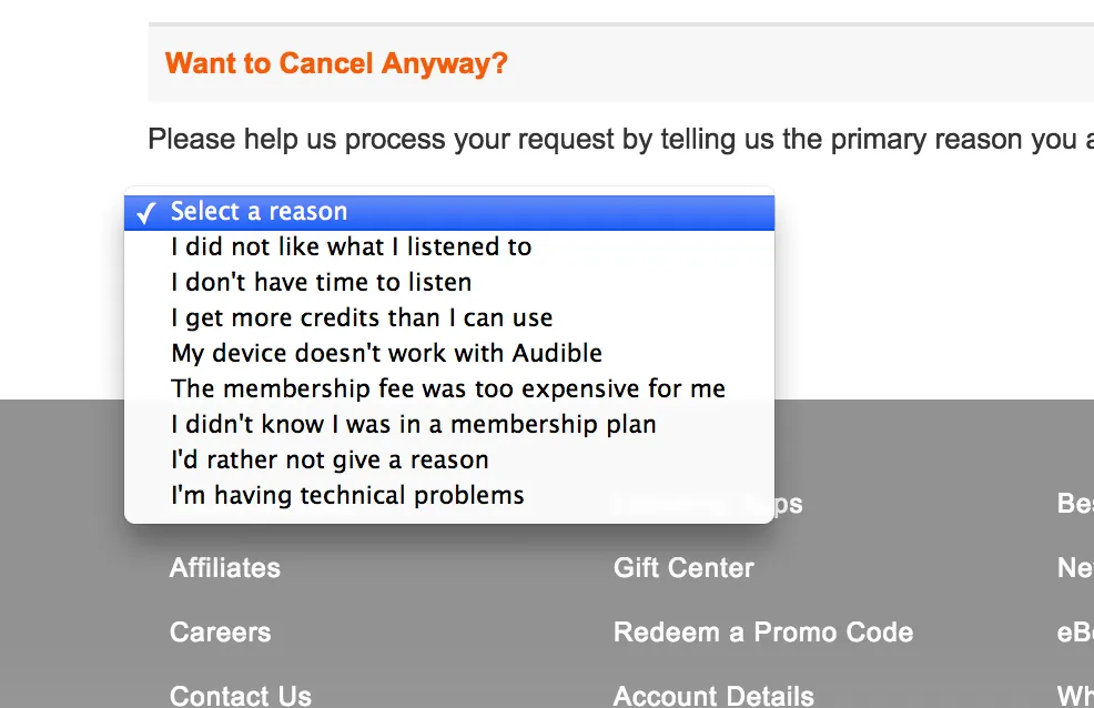
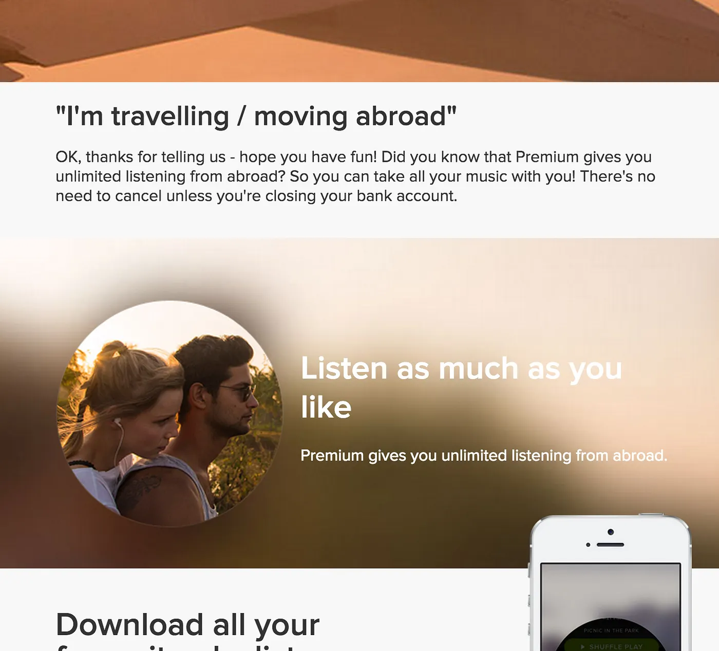
Software is usually designed as a choose-your-own-adventure affair. To complete tasks, users move through an application by making a series of choices based on available options. This can include choosing an item from a menu, choosing the appropriate tool from a toolbar, or selecting a piece of content from a list. The user is always free to decide for themselves, but the design and presentation of these options has the power to greatly influence the choices they make.

In their book, Nudge, Richard Thaler and Cass Sunstein make an argument for what they call “libertarian paternalism” in the design and architecture of choices. The idea is that we can design software that allows a person to make his or her own choices (libertarianism), but that we also have the power to “nudge” that person in the direction of his or her best interest (paternalism). Of course, this means we can also nudge people in a direction that is in our best interest. As Thaler and Sunstein write, “There is no such thing as neutral design.”

As designers, every decision we make has the potential to nudge a user down a specific path. Sometimes, the consequences of these nudges are beneficial. Sometimes they’re not. To create a stellar user experience, we must explicitly define when and how we nudge.

Here’s a simple, two-step framework for deciding when to nudge, how to nudge, and what outcome is “best” in a given choice architecture.

Step 1: Defining the Best Outcomes

Whenever you’re presenting a user with a choice, ask yourself: What are the user’s goals at this point? Which options will best help them achieve those goals? What are the business goals in this situation? Which options best deliver on those goals? Do the user’s best options match those of the business?

I recommend setting up a two-by-two grid to answer these questions. I call it a choice outcome matrix:

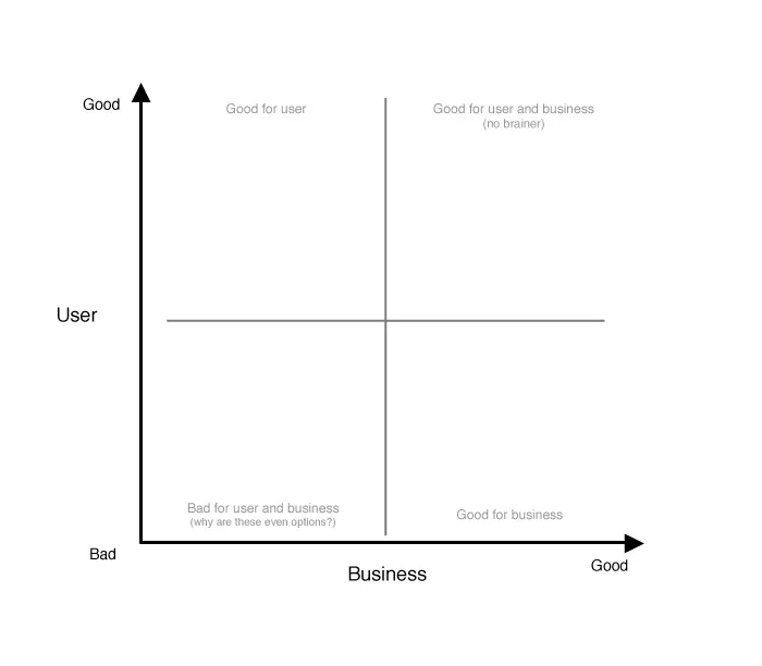
The choice outcome matrix plots possible choices based on their benefit to the user vs. their benefit to the business. Choices that are good for the business and good for the user are no-brainers; your designs should nudge toward these. Choices that are bad for the business and bad for the user should probably be eliminated from the set of options all together. Choices that are good for one but not the other aren’t as simple. Determining the best outcome here is a case-by-case decision. Ask yourself: Do we value the business outcome over the user experience in this case, or vice versa? In these cases, you can also consider what would need to change to better align the two.

Take, for example, a user signing up for a subscription service in which they’re presented with two plan options: a free, ad-supported plan or a premium, ad-free plan at $9.99 per month.

These choices are plotted on the matrix below:

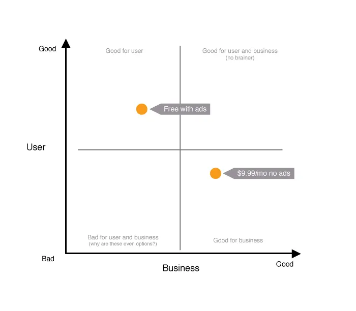
In this basic example, the free plan is better for the user because it’s free. The pay plan is better for the business from a revenue standpoint, but worse for the user because of the cost. (Note: This assumes a pretty benign ad experience. If ads are intrusive, the plot might look different — meaning, it might be worth it for a user to pay to avoid ads.)

How might this matrix influence a final design? Here’s how Spotify handled a similar scenario:


Behold: Nudging by design. In the green button and banner, Spotify is nudging users toward its premium plan, which is best for the business. In this specific scenario, they also added a 30-day free trial and some extra features (offline listening, additional devices) to the premium plan. These extra features help to better align the best choice for the business with the best choice for the user.

Step 2: Choosing How to Nudge

Once you’ve identified which choice represents the best outcome, you then must choose the best approach to encourage that choice. Here are three basic approaches to consider:

  1. Visual: Spotify is a prime example of a visual nudge. Its designers use color, size, and placement on the page to drive users toward a specific choice.

  2. Social: Humans have a strong desire to conform. We’re often guided by the actions of others, even if we don’t realize it. Presenting social “proof” of the value of a specific choice can be a strong nudge. Amazon, for example, uses social nudges like customer reviews and ratings to guide users toward purchasing the best available products. Similarly, YouTube displays the number of views a video has received as a subtle social nudge to help you choose videos you’re most likely to enjoy (and engage with).

  3. Default: Setting something as a default in an application is one of the most powerful nudges a designer can apply. In a 2011 study, the folks at User Interface Engineering (UIE) found that more than 95 percent of Microsoft Word users surveyed had not changed a single default setting in the application. Of the five percent who did, many were programmers and designers (in case you need more proof that we aren’t normal). So, unless you’re building an application just for designers and programmers, it’s critical that you get your defaults right. As Jeff Atwood puts it in his blog Coding Horror, “Defaults are arguably the most important design decisions you’ll ever make as a software developer.”
    In most cases, the default becomes the permanent choice.

Choices that fall in the “good for the user and for the business” area of the choice outcome matrix are a great place to start when defining defaults.

At the time of the UIE study, autosave in Microsoft Word was defaulted to “off.” If you’ve ever lost work in Word because you forgot to save, you’d probably agree this may not have been the best design choice. Using a choice outcome matrix to explicitly map the impact of these decisions before they go live can save users a lot of frustration. Here’s what Microsoft’s map would have looked like:

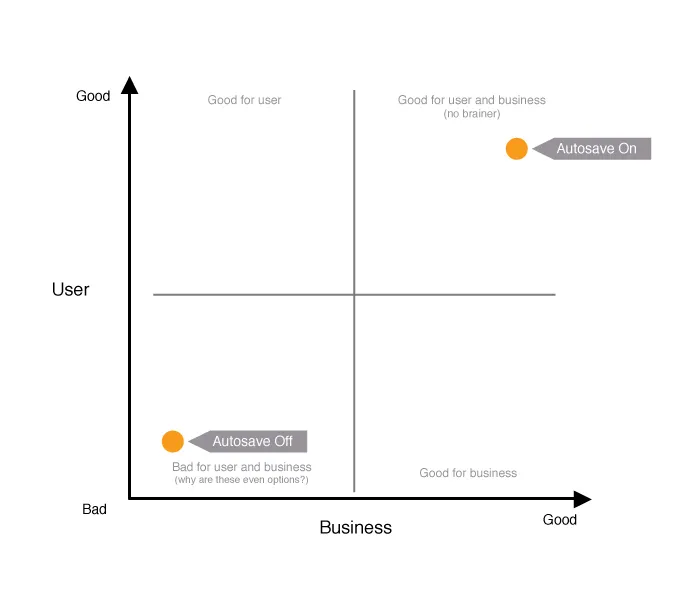
If defaulting autosave to off were good for the business — maybe because of some technical impact, or because of storage space requirements — using the matrix to explicitly plot the impact would have prompted designers to mitigate these issues in advance. Maybe they would’ve communicated it more effectively to users, or would have been able to build additional features to align the user’s best interest with theirs.

Designing choices is at the core of interaction design. We must be intentional about how we present choices to users. If we can encourage them toward the best outcomes (for them and for us) we can save ourselves a lot of frustration and build trust with our users along the way.

A Simple Framework for Designing Choices” was originally published in Medium on February 12, 2015.

Web companies hate losing customers. The cost to acquire new customers is high, and engaged users are the revenue-generating lifeblood we all desperately need to keep going.

We spend a lot of effort creating new content and building new features to bring value to current users and entice them to stay. When users do leave, the prevailing wisdom is that something must have been wrong with the product. We build cancel questionnaires around this assumption, with options that are largely product-centric.

Assuming every problem is product-related drives a product-centric approach to fixing them. But what if problems are more complex than simple fixes to content or features?

An engineer I used to work with once said — and this is incredibly insightful advice for product managers — “People are complicated.”

I work for a video-streaming service with a monthly subscription model (similar to Netflix). A few months ago we ran a survey with a group of users who’d cancelled the service. We asked about satisfaction across three product areas: usability, content (videos), and access (can you access the service on your preferred devices). The results were surprising. Even users who’d canceled the service rated their satisfaction high in all three areas. And their overall satisfaction with the service was rated just as high. Needless to say, we were perplexed. Why would someone cancel a service with which they were highly satisfied?

It wasn’t until a few weeks later, as I was reading Daniel Kahneman’s book, Thinking, Fast and Slow, that the answer became clear.

What makes someone satisfied?

Kahneman, a psychologist and Nobel Laureate in economics, dedicates a significant portion of his book to examining the psychological underpinnings of how people make decisions. The part that struck me specifically was his discussion of the way an object’s utility impacts our desire to have it — and, ultimately, how it impacts our satisfaction.

The utility of an object is defined as its perceived ability to satisfy a need or desire. The more utility a person perceives something to have, the more satisfying it is for them. Kahneman explains this from an economic perspective:

A gift of 10 [dollars] has the same utility to someone who already has 100 [dollars] as a gift of 20 [dollars] to someone whose current wealth is 200 [dollars]. We normally speak of changes of income in terms of percentages, as when we say “she got a 30% raise.” The idea is that a 30% raise may evoke a fairly similar psychological response for the rich and for the poor, which an increase of $100 will not do.

To extrapolate, a gift of $10 has less utility (and satisfaction) to a person who already has $200 than it does to someone who only has $100. The basic concept is that everyone who is considering purchasing a product weighs its perceived utility against its cost. If the utility seems high enough to justify the cost, the consumer is more likely to buy.

So, a customer comes to your service. They weigh utility vs. price, choose to purchase it, and are satisfied with the experience. Why would they still decide to cancel?

This is where things get interesting. The original idea, put forth by Daniel Bernoulli in 1738, emphasizing the role of utility in decision making is actually flawed. It assumes that it is the inherent utility of an object that makes a person more or less satisfied — that if you and I both have $100 we will be equally satisfied based on the inherent value of $100. As Kanheman shows, this assumption is wrong:

Today Jack and Jill each have a wealth of 5 million.
Yesterday, Jack had 1 million and Jill had 9 million.
Are they equally happy? (Do they have the same utility?)

It is pretty clear that Jack would be stoked and Jill would be reeling — even though they both have $5 million, which should have the same inherent utility. As Kanheman puts it:

The happiness that Jack and Jill experience is [actually] determined by the recent change in their wealth, relative to the different states of wealth that define their reference points (1 million for Jack, 9 million for Jill).

This was my aha moment.

Satisfied people aren’t canceling because the inherent value of the product has changed. What has changed is the utility they perceive in that moment, based on their current life state.

As part of our cancellation process, the organization I work for has a simple questionnaire. One of the options customers can click to tell us why they cancelled is “other,” with an open text field. As I went back through the responses, I noticed some consistencies:

Traveling for the summer, will be back.

Got laid off, will be back when I find a job.

Have a pile of books I need to read.

These “other” responses had previously slipped under the radar, but now they were coming through loud and clear. Hoping to retain customers by keeping them on a path of continual engagement blatantly ignores the fact that people have lives beyond your product.

Our current approach to customer retention — improving the product itself — assumes that the inherent value of the product is what satisfies. We’re making the same mistake Bernoulli did over 200 years ago. What we’ve found is that, often, people are satisfied with the product but changes in their life situation have temporarily decreased its perceived utility. That decrease shifts the utility vs. cost equation in their minds.

Not all cancels are created equal

Don’t get me wrong, product improvements do help the overall experience. They’re an important piece of the puzzle, but they’re not the silver bullet for increasing customer retention.

We must redefine “retained customer.”

Loyalty does not mean a customer must stay with you indefinitely. If a user cancels in order to travel, then comes back to the service a month, or two, or three later, did you really ever lose them? A cancel is only a cancel if they don’t intend to come back.

The goal of any business is to create a great experience, and to support the needs of its customers. What if we embraced and respected the fact that people have lives outside of our products? What if we designed for the fact that the utility we deliver will ebb and flow with the changes in their life situation? How would we structure our products to support that?

Spotify starts down this road with their cancellation process. They include an option to say you’re traveling and then, before you make the final decision to cancel, they deliver a nice explanation of how they can support your trip. Here’s what it looks like:


However, Spotify’s approach to the user’s response that “I’m trying to save money” tries to convince the user that Spotify is the best use of his or her money, which I’d argue doesn’t respect a user’s need to manage his or her current life situation.


Think: User-centered retention

Take time to identify the kinds of external events that may temporarily impact the utility of your product. Then, develop retention strategies around those events.

Is your product impacted by nice summer weather, when people want to spend more time outside? Instead of fighting it by convincing them to come inside, develop features that help your users take advantage of the weather — or features that encourage them to take your product along. Or, accept that summer may be a low point and focus hard on having great content and features ready when temperatures drop. TV networks get it. Summer is a time for reruns.

If you have a cancel questionnaire, structure it to be as user-centric as it is product-centric. Give your users the option to tell you why they’re leaving instead of pushing them down a specific path. You might learn something.

Don’t assume everyone who leaves is a dissatisfied customer. Sometimes, life happens. If you make it hard for people to quit when they need to, or pester them to come back before they’re ready, you run the risk of frustrating someone who would’ve otherwise returned on their own.

Instead, respect that your users need to manage their own lives. Understand that your product is only a part of their lives, and you’ll be rewarded with loyal customers who return again and again.

To Keep a User, Sometimes You Have to Let Them Go” was originally published in Medium on February 3, 2015.

A lot has been made of the need for designers who can code. A quick google search for “should designers learn to code” yields 25 million results.

To be straight from the outset, I don’t completely disagree with the premise. However, I think the statement, “we need designers who can code” misrepresents the underlying issue.

As the head of a product design team, who can also write code (front and back end), I understand the value of the combined skill set. The ability to prototype, the ability to converse cross-discipline, and the ability to understand capabilities and tweak implementations. But I also know where the boundaries lie. I am not a developer and I wouldn’t want my code underlying a production application at scale.

Saying designers should code creates a sense that we should all be pushing commits to production environments. Or that design teams and development teams are somehow destined to merge into one team of superhuman, full-stack internet monsters.

Let’s get real here. Design and development (both front end and back end) are highly specialized professions. Each takes years and countless hours to master. To expect that someone is going to become an expert in more than one is foolhardy.

Here’s what we really need: designers who can design the hell out of things and developers who can develop the hell out of things. And we need them all to work together seamlessly.

This requires one key element: empathy.

What we should be saying is that we need more designers who know about code.

The reason designers should know about code, is the same reason developers should know about design. Not to become designers, but to empathize with them. To be able to speak their language, and to understand design considerations and thought processes. To know just enough to be dangerous, as they say.

This is the sort of thing that breaks down silos, opens up conversations and leads to great work. But the key is that it also does not impede the ability of people to become true experts in their area of focus.

When someone says they want “designers who can code”, what I hear them saying is that they want a Swiss Army knife. The screwdriver, scissors, knife, toothpick and saw. The problem is that a Swiss Army knife doesn’t do anything particularly well. You aren’t going to see a carpenter driving screws with that little nub of a screwdriver, or a seamstress using those tiny scissors to cut fabric. The Swiss Army knife has tools that work on the most basic level, but they would never be considered replacements for the real thing. Worse still, because it tries to do so much, it’s not even that great at being a knife.

Professionals need specialized tools. Likewise, professional teams need specialized team members.

I don’t want my designers spending all their time keeping up with the latest cross-browser CSS solutions or learning how to use javascript closures. In the same way that I wouldn’t want our developers spending all their time diving into color theory.

I want my designers staying up on mobile interface standards and the latest usability best practices. I want them studying our users and identifying unmet needs. I want them focused on the work that is going to make our product the best that it can be. And yes, part of that work means learning about code, so they can be effective, empathetic members of the larger product team.

Now, implicit in learning about code or about design is getting your hands dirty. So this does mean that developers should be able to look critically at design concepts from a user-centered perspective, and that designers should be able to understand the basic underpinnings of how their design will be implemented. If they can also throw together a rough prototype, bonus. But we need to rid ourselves of the idea (and pressure) that designers should be coders, or that developers should be designers.

Convergence has its place, but this is not it.

If you empower your team to focus on their strengths as well as do some work to gain empathy for their teammates, then you don’t need Swiss Army knives. Instead, you have a toolbox full of experts that now work better together.

That’s what we really need.

We Don’t Need More Designers Who Can Code was originally published in Medium on December 9, 2014.

Great design is driving business success. Soon, being a design-driven company will be table stakes. But building a company that values the innovative power of design is not an easy task. For startups, the challenge is creating a design-driven culture from the ground up. For established companies, it’s even more arduous. Replacing the old status quo with a whole new mindset and process. No matter what stage your company is in, there is one decision you can make today that will put you well on your way to design-driven success:

Hire people who make things.

From the person who checks in guests at the front desk to your chief executives, to your customer service reps, engineers and your designers. Hire people who make things. Not just make things for their job, but make things on their own time because they freakin’ love to. Fill every single role in your company with people who actively participate in the act of being generative.

To be design driven doesn’t just mean hiring the best designers you can (though that is part of it), it means creating an organization that understands and embraces the struggle required to create something.

People who make things get the creative struggle.

It doesn’t matter what they make. If they crochet dollies, or code applications, craft with their kids, write music, blog or bake pastries. Makers understand the creative process. They understand the anxiety, the excitement and feeling of ownership that comes with creation. They grok ideation and iteration and the self-confidence required to ship something they created.

Why does this matter?

Empathy

One of the biggest challenges I have as a designer is deciding when to show work to people in the organization. The challenge is that many people have trouble wrapping their heads around early stage work. They can’t look at it for what it is and give constructive feedback based on that. They tend to view all design work as they would a final product. Because of this, you hold off showing. You do more “polish” work than problem solving work. And when you do show it, and changes come up, you’ve put in way more time than you should have and you now have a compressed timeline for iteration. You pay the price in organizational speed and efficiency, and ultimately work quality.

If you fill your organization with people who possess empathy for the creative process, then everyone understands early stage work and it’s easier to work through rough concepts constructively. Work moves faster, feedback comes sooner, less time is wasted and the end product is better for it.

Pride of Ownership

Makers know what it means to attach their name to something. To pour themselves into something and then sign their name at the bottom for all to see. This takes self-confidence and pride of ownership. They won’t sign their name to crap work and they won’t sign your company’s name to crap work either. If your organization is staffed, wall-to-wall, with this mentality then everyone will hold each other accountable for what goes out the door.

Innovation From All

Makers are explorers. They are actively looking for inspiration, new ideas and watching cultural happenings. Ideas can come from anywhere in an organization. If you hire a diverse group of makers, ideas will come from everywhere. Just be sure you are ready to listen.

Appetite for Risk

To create something is to be willing to take risks. To take a risk on yourself (putting yourself out there), as well as to take a risk on an idea. The scale of the risk varies, but it is the underlying mentality that is important. One key to disruptive innovation is the willingness to take risks. Established companies are often upended by small upstarts because they are unwilling to risk something new. Being a company that is willing to take risks is not just about having one, or a few, “brave” leaders. Companies create real value when people at all levels are willing and empowered to take risks. If people are able to take risks in their day-to-day job then a system of diffused innovation can grow, impacting everything from daily processes to major product initiatives.

Great, but why does my front desk person need to make things?

Ultimately, this is all about culture. The more pervasive the innovative, maker mindset is in your organization, the deeper it is engrained in your culture. In the end this translates to a more empathic process, more ideas, greater individual initiative, shared accountability and a higher appetite for risk. All of which are fundamental ingredients for design-driven success.

The next step is harnessing those ingredients. But that’s another post for another time.

Maker culture is in full tilt, explosion mode. This is an important trend, not just because of the possible impacts on the future, but because it is expanding the population of people who create. This means you have more opportunity to bring those people into your company.

Go get ‘em.

Want to be Design Driven? Hire People Who Make Things was originally published in Medium on December 9, 2014.