Two days ago I moved offices from one side of the building to the other. I had a plan for the new space but I didn’t have all the stuff yet. So I set up a small Ikea table in the corner of the room. It’s all I needed to do my job. No big deal, right?
What happened next was a little unexpected, but was an insight into human nature that put a fine point on one of the challenges we run into every day trying to create great products.
In the 48 hours since the move that small room has drawn more attention than anything else in the entire office. Hardly a single person has been able to walk by without stopping to comment.
“You know that’s a desk for a fifth grader.”
“You could us a little more stuff in here.”
“Is that all the furniture they’d give you?”
“Maybe some wall art?”
“Interesting. There’s a lot of potential in here.”
I’ve received literally 30 comments in two days. Given the size of our org, that’s well over a 50% comment rate. Some people have stopped multiple times. One person insisted she get a picture of me (as seen above).
It freaks people out. There is a palpable tension every time someone stops. People clearly think it’s weird, or I’m weird, or whatever. They are uncomfortable. But what’s most interesting is that, inevitably, the conversation steers toward how I’m going to fill the space. What I’m going to add. When I assure people that more stuff is coming they visibly relax. All is right with the world once again.
There is something a little off-putting, but also compelling, about empty space. Honestly, sitting at that little desk in that empty room does make me feel weird. Nature abhors a vacuum and people abhor unused space. We feel a deep need to fill it.
“Interesting. There’s a lot of potential in here.”
We see potential in unused space. Not potential for the sake of it’s emptiness, but potential for what we can put in it. However, great products keep things simple. They solve problems in the clearest and most concise way. The challenge comes in keeping it that way.
A new product starts out with the core features needed to solve the problem. But then that feeling of discomfort starts to creep in. There’s still room for more stuff, why aren’t we filling it? We start to see potential in the empty spaces. So we add features. We extend. We expand. And before we know it our simple, clear product is bloated, overcrowded and confusing. On top of that, you’ll probably find that all those additional features didn’t really add that much value for the user.
Sometimes a tiny desk is all you need to do the job. The more I sit in that empty room, the more comfortable I get.
The more comfortable we can get with the existence of empty space, the more we can understand the significant value it holds. It’s simple, it’s clean, it lacks distraction. There is room to breath in there. One key to great product design is resisting the urge to fill all the empty space. The features you say no to are as important as the ones you say yes to. It feels uncomfortable and it will meet resistance, the urge to fill the space is strong, but if you give your products room to breath your users will thank you.
As the father of two tiny people, I’ve spent a lot of time with big purple dinosaurs, curious monkeys and little backpack wearing adventurers. Interestingly, I‘ve discovered that kids shows can teach us a lot about good product design, especially that Dora the Explorer.
Make It Predictable
Every episode of Dora is the same. There is a clear end goal and Dora has to go through three steps to get there. The goal and the steps are articulated (repeatedly) by Dora and her friends throughout the adventure. This repetitive structure makes the show extremely enjoyable for kids because they can master it. They get what needs to happen, they understand the steps to get there and they know what’s coming next.
People are driven by a desire for mastery. We want to feel accomplished and capable. The easier it is for a person to master a product the more likely they are to feel good about the experience. Predictability goes a long way toward making that happen. There are a number of ways to make a product predictable:
Maintain design consistency: Users should know what design elements mean, no matter where they appear in an experience. If tapping a specific icon is supposed to open a navigation menu, it needs to open that menu every time it appears. If it doesn’t, the user loses the ability to predict what the icon means and no longer knows when or how to use it.
Leverage established design patterns: It can be enticing to get creative and reinvent the wheel, but using established design patterns for common tasks means less “new” for the user to learn.
Use metaphors and animations: Well crafted metaphors and animations help users understand where they are in an experience, what state things are in, what options are available to them and what they should do next.
Use Simple Language
Dora is aimed at little kids so the language is simple and the dialogue is concise.
Your product might not be aimed at kids but there is rarely a downside to simple and concise language. The average adult American reads at a 7th — 8th grade level. Unless your product or market demands technical jargon or higher-level vocabulary, avoid it. This is especially important to keep in mind with error messages, where lack of comprehension has a higher likelihood of leading to user frustration.
Provide the Necessary Tools
On every adventure, Dora inevitably runs into problems. Swiper the Fox steals something, or she has to get past snakes, or alligators, or whatever. But, the ever-resourceful Dora has it covered thanks to her magic, talking backpack and her equally magic, equally talky map. The map keeps her on the right track, and her backpack is full (conveniently) of just what she might need at any given moment.
You can’t always predict what’s going to happen to your users in the wild. You can do your best to guide them down specific paths or toward specific outcomes, but people are complicated. They do what they want. And they will definitely do something you didn’t think of. It is important to always have a set of tools available to help them overcome problems they might encounter.
This includes navigational tools to help get them back on track if they end up in the wrong place, as well as functional tools to help them accomplish tasks, make decisions, and undo mistakes. Delivering just what a user needs right when they need it makes for a magical experience. You might not be able to give them a magic, talking backpack, but if you are thoughtful about the way you surface and design your tools, you can come pretty damn close.
Coming out of school as newly minted designers, we often aspire to the heights of master craftsmanship. We envision ourselves creating expertly designed, meticulously implemented products that inspire awe with their beauty, artistry, and execution.
Then the real world promptly smacks us in the face.
Craftsmen spend untold hours creating their masterpieces. They sweat the details and pour their souls into the work. Their final creations are as much art as they are products.
Somewhere in our industrialized rush, we’ve lost our sense of craftsmanship.
We, on the other hand, find ourselves saddled with impossible deadlines that require us to compromise on features and details. It’s all we can do just to get the project done. Our final products are minimum viable. They’re driven by the invisible hand of the market, which relentlessly demands speed so we can squeeze out a few more sales for the quarter. Getting a product out is considered better than getting it perfect.
The craftsman is not worried about speed. The craftsman is worried about the quality and value of the final product.
Somewhere in our industrialized rush, we’ve lost our sense of craftsmanship. To succeed in the future, we’ll need to find it again.
Do We Need Speed?
Speed is cancer to craftsmanship. But the idea that speed is a positive quality runs deep. Like, primordial deep. In the book Metaphors We Live By, authors George Lakoff and Mark Johnson explain that our positive association with speed dates back to the dawn of humanity, when early man observed that healthy humans walked at a quicker pace than those who were not healthy. The rest, in our primitive lizard brains, is history. Fast is better than slow.
We haven’t evolved much past that.
We assume first to market is best. Yet, according to researchers at Northwestern, late entrants to a market are more successful than first-movers 70 percent of the time.
When a startup does win, it’s often not because they were fast, but because they were focused.
We mythologize the fast, nimble startup that disrupts the lumbering, established market leader. But, like the plane crash that makes us question the safety of flying, these rare, widely covered stories do not represent the full picture. The average startup does not win the battle, regardless of how fast it moves. When Richard Branson weighed in on this, his advice for entrepreneurs was littered with words like long-term, carefully, and wisely. Those words don’t sound fast at all.
When a startup does win, it’s often not because they were fast, but because they were focused. Just as when a larger company is disrupted, it’s not necessarily because it was slow, but because it lacked focus as its business grew to multiple markets and products.
Focus, therefore, is more important than speed.
The Hare was faster than the Tortoise, but the Tortoise won because the Hare lost focus.
The Changing Complexion of the Market
The driving mantra of fast-moving tech companies is out is better than perfect. However, a seismic shift is happening in the way consumers think about products and what they’re willing to pay for. The shift means we may need to rethink that mantra.
To ‘own something’ in the traditional sense is becoming less important, because what’s scarce has changed. Ownership just isn’t hard anymore. We can now find and own practically anything we want, at any time, through the unending flea market of the Internet. Because of this, the balance between supply and demand has been altered, and the value has moved elsewhere.
I’d take this a step further. I don’t think this change is just about scarcity, I think it is also about quality. The world is flooded with worthless crap. Speed drives quantity over quality, and the durability and lifespan of our stuff has been steadily declining.
In the digital space, quality does not necessarily come from how long something lasts. Quality is a combination of utility and design. A great product needs to solve a real problem in a thoughtful, simple way.
So much of what we create does not solve a real problem. And even if it does, it likely wasn’t created all that thoughtfully. How could it be, when the main goal is to just get something out there? This quote from 2010 in Apple’s app review guidelines sums it up nicely:
“We have over 250,000 apps in the App Store. We don’t need any more Fart apps.”
As Dykstra put it:
Humanity is experiencing an evolution in consciousness. We’re starting to think differently about what it means to ‘own’ something. This is why a similar ambivalence towards ownership is emerging in all sorts of areas, from car-buying to music listening to entertainment consumption…the big push behind it all is that our thinking is changing.
Couple this ambivalence with growing concerns about environmental and social impact and you’ve got yourself a consumerism revolution in the making.
“The biggest insight we can glean from the death of ownership is about connection,” Dykstra writes. “This is the thing which is now scarce, because when we can easily acquire anything, the question becomes, ‘What do we do with this?’”
We no longer care about acquiring — we care about connecting. With each other, with ourselves, and with our environment.
Creating a product that drives a true connection with a person requires thoughtfulness and a relentless obsession. It requires craftsmanship.
What Do We Do With This?
Speed is not an advantage anymore. In the digital space, the technical playing field has been leveled by open source tools and frameworks. Everyone now has the ability to move quickly. Advances like 3D printing are likely to bring similar change in the manufacturing world as well. Being first is now more irrelevant than ever.
Magic takes time. Magic takes craftsmanship.
More importantly, the consumer mindset is shifting. People are becoming more and more selective about what to spend their money on. Apple understood this before almost anyone else, and they’ve led a design revolution that has changed the expectations of every consumer who chooses to buy a product. Thoughtfulness and great design matter.
It’s no longer enough for a product to simply exist. To succeed, future products need that thing, that je ne sais quoi, that magic. And magic takes time. Magic takes craftsmanship.
Craftsmanship is the new advantage.
Companies have to sweat the details. We can’t be afraid to push our timelines to get something right. As designers and developers, we’re doing ourselves, our companies, and our end users a disservice by cutting corners to hit deadlines and striving for minimum viable products.
Software is usually designed as a choose-your-own-adventure affair. To complete tasks, users move through an application by making a series of choices based on available options. This can include choosing an item from a menu, choosing the appropriate tool from a toolbar, or selecting a piece of content from a list. The user is always free to decide for themselves, but the design and presentation of these options has the power to greatly influence the choices they make.
In their book, Nudge, Richard Thaler and Cass Sunstein make an argument for what they call “libertarian paternalism” in the design and architecture of choices. The idea is that we can design software that allows a person to make his or her own choices (libertarianism), but that we also have the power to “nudge” that person in the direction of his or her best interest (paternalism). Of course, this means we can also nudge people in a direction that is in our best interest. As Thaler and Sunstein write, “There is no such thing as neutral design.”
As designers, every decision we make has the potential to nudge a user down a specific path. Sometimes, the consequences of these nudges are beneficial. Sometimes they’re not. To create a stellar user experience, we must explicitly define when and how we nudge.
Here’s a simple, two-step framework for deciding when to nudge, how to nudge, and what outcome is “best” in a given choice architecture.
Step 1: Defining the Best Outcomes
Whenever you’re presenting a user with a choice, ask yourself: What are the user’s goals at this point? Which options will best help them achieve those goals? What are the business goals in this situation? Which options best deliver on those goals? Do the user’s best options match those of the business?
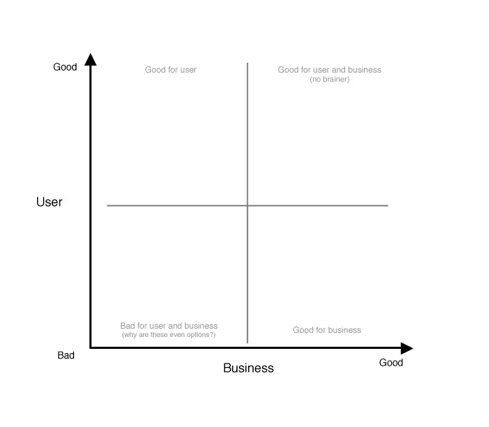
I recommend setting up a two-by-two grid to answer these questions. I call it a choice outcome matrix:
The choice outcome matrix plots possible choices based on their benefit to the user vs. their benefit to the business. Choices that are good for the business and good for the user are no-brainers; your designs should nudge toward these. Choices that are bad for the business and bad for the user should probably be eliminated from the set of options all together. Choices that are good for one but not the other aren’t as simple. Determining the best outcome here is a case-by-case decision. Ask yourself: Do we value the business outcome over the user experience in this case, or vice versa? In these cases, you can also consider what would need to change to better align the two.
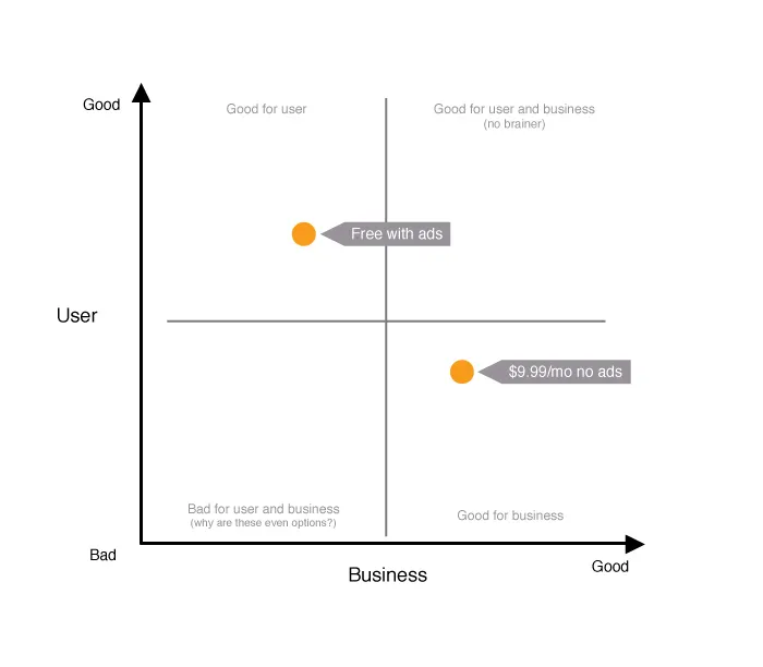
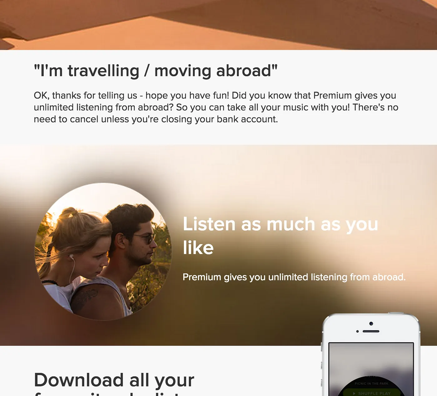
Take, for example, a user signing up for a subscription service in which they’re presented with two plan options: a free, ad-supported plan or a premium, ad-free plan at $9.99 per month.
These choices are plotted on the matrix below:
In this basic example, the free plan is better for the user because it’s free. The pay plan is better for the business from a revenue standpoint, but worse for the user because of the cost. (Note: This assumes a pretty benign ad experience. If ads are intrusive, the plot might look different — meaning, it might be worth it for a user to pay to avoid ads.)
How might this matrix influence a final design? Here’s how Spotify handled a similar scenario:
Behold: Nudging by design. In the green button and banner, Spotify is nudging users toward its premium plan, which is best for the business. In this specific scenario, they also added a 30-day free trial and some extra features (offline listening, additional devices) to the premium plan. These extra features help to better align the best choice for the business with the best choice for the user.
Step 2: Choosing How to Nudge
Once you’ve identified which choice represents the best outcome, you then must choose the best approach to encourage that choice. Here are three basic approaches to consider:
Visual: Spotify is a prime example of a visual nudge. Its designers use color, size, and placement on the page to drive users toward a specific choice.
Social: Humans have a strong desire to conform. We’re often guided by the actions of others, even if we don’t realize it. Presenting social “proof” of the value of a specific choice can be a strong nudge. Amazon, for example, uses social nudges like customer reviews and ratings to guide users toward purchasing the best available products. Similarly, YouTube displays the number of views a video has received as a subtle social nudge to help you choose videos you’re most likely to enjoy (and engage with).
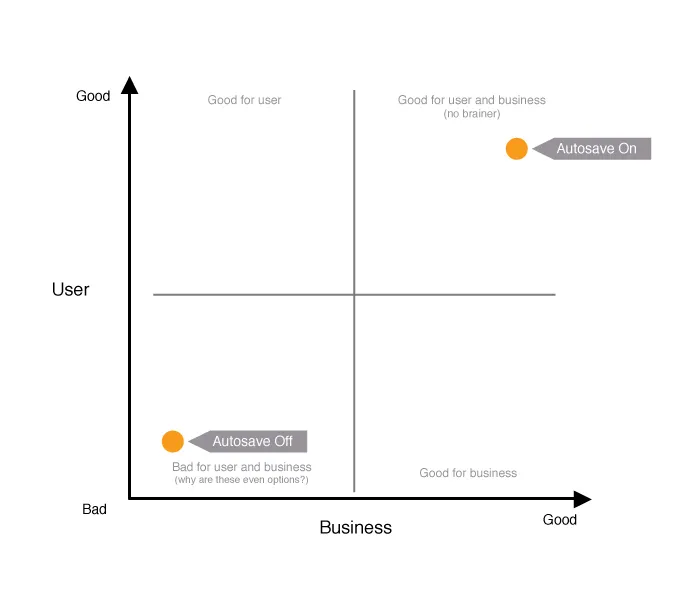
Default: Setting something as a default in an application is one of the most powerful nudges a designer can apply. In a 2011 study, the folks at User Interface Engineering (UIE) found that more than 95 percent of Microsoft Word users surveyed had not changed a single default setting in the application. Of the five percent who did, many were programmers and designers (in case you need more proof that we aren’t normal). So, unless you’re building an application just for designers and programmers, it’s critical that you get your defaults right. As Jeff Atwood puts it in his blog Coding Horror, “Defaults are arguably the most important design decisions you’ll ever make as a software developer.” In most cases, the default becomes the permanent choice.
Choices that fall in the “good for the user and for the business” area of the choice outcome matrix are a great place to start when defining defaults.
At the time of the UIE study, autosave in Microsoft Word was defaulted to “off.” If you’ve ever lost work in Word because you forgot to save, you’d probably agree this may not have been the best design choice. Using a choice outcome matrix to explicitly map the impact of these decisions before they go live can save users a lot of frustration. Here’s what Microsoft’s map would have looked like:
If defaulting autosave to off were good for the business — maybe because of some technical impact, or because of storage space requirements — using the matrix to explicitly plot the impact would have prompted designers to mitigate these issues in advance. Maybe they would’ve communicated it more effectively to users, or would have been able to build additional features to align the user’s best interest with theirs.
Designing choices is at the core of interaction design. We must be intentional about how we present choices to users. If we can encourage them toward the best outcomes (for them and for us) we can save ourselves a lot of frustration and build trust with our users along the way.
Web companies hate losing customers. The cost to acquire new customers is high, and engaged users are the revenue-generating lifeblood we all desperately need to keep going.
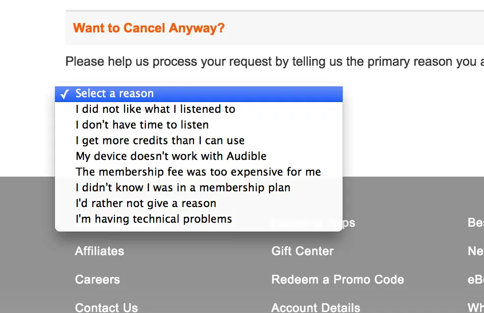
We spend a lot of effort creating new content and building new features to bring value to current users and entice them to stay. When users do leave, the prevailing wisdom is that something must have been wrong with the product. We build cancel questionnaires around this assumption, with options that are largely product-centric.
Assuming every problem is product-related drives a product-centric approach to fixing them. But what if problems are more complex than simple fixes to content or features?
An engineer I used to work with once said — and this is incredibly insightful advice for product managers — “People are complicated.”
I work for a video-streaming service with a monthly subscription model (similar to Netflix). A few months ago we ran a survey with a group of users who’d cancelled the service. We asked about satisfaction across three product areas: usability, content (videos), and access (can you access the service on your preferred devices). The results were surprising. Even users who’d canceled the service rated their satisfaction high in all three areas. And their overall satisfaction with the service was rated just as high. Needless to say, we were perplexed. Why would someone cancel a service with which they were highly satisfied?
It wasn’t until a few weeks later, as I was reading Daniel Kahneman’s book, Thinking, Fast and Slow, that the answer became clear.
What makes someone satisfied?
Kahneman, a psychologist and Nobel Laureate in economics, dedicates a significant portion of his book to examining the psychological underpinnings of how people make decisions. The part that struck me specifically was his discussion of the way an object’s utility impacts our desire to have it — and, ultimately, how it impacts our satisfaction.
The utility of an object is defined as its perceived ability to satisfy a need or desire. The more utility a person perceives something to have, the more satisfying it is for them. Kahneman explains this from an economic perspective:
A gift of 10 [dollars] has the same utility to someone who already has 100 [dollars] as a gift of 20 [dollars] to someone whose current wealth is 200 [dollars]. We normally speak of changes of income in terms of percentages, as when we say “she got a 30% raise.” The idea is that a 30% raise may evoke a fairly similar psychological response for the rich and for the poor, which an increase of $100 will not do.
To extrapolate, a gift of $10 has less utility (and satisfaction) to a person who already has $200 than it does to someone who only has $100. The basic concept is that everyone who is considering purchasing a product weighs its perceived utility against its cost. If the utility seems high enough to justify the cost, the consumer is more likely to buy.
So, a customer comes to your service. They weigh utility vs. price, choose to purchase it, and are satisfied with the experience. Why would they still decide to cancel?
This is where things get interesting. The original idea, put forth by Daniel Bernoulli in 1738, emphasizing the role of utility in decision making is actually flawed. It assumes that it is the inherent utility of an object that makes a person more or less satisfied — that if you and I both have $100 we will be equally satisfied based on the inherent value of $100. As Kanheman shows, this assumption is wrong:
Today Jack and Jill each have a wealth of 5 million. Yesterday, Jack had 1 million and Jill had 9 million. Are they equally happy? (Do they have the same utility?)
It is pretty clear that Jack would be stoked and Jill would be reeling — even though they both have $5 million, which should have the same inherent utility. As Kanheman puts it:
The happiness that Jack and Jill experience is [actually] determined by the recent change in their wealth, relative to the different states of wealth that define their reference points (1 million for Jack, 9 million for Jill).
This was my aha moment.
Satisfied people aren’t canceling because the inherent value of the product has changed. What has changed is the utility they perceive in that moment, based on their current life state.
—
As part of our cancellation process, the organization I work for has a simple questionnaire. One of the options customers can click to tell us why they cancelled is “other,” with an open text field. As I went back through the responses, I noticed some consistencies:
Traveling for the summer, will be back.
Got laid off, will be back when I find a job.
Have a pile of books I need to read.
These “other” responses had previously slipped under the radar, but now they were coming through loud and clear. Hoping to retain customers by keeping them on a path of continual engagement blatantly ignores the fact that people have lives beyond your product.
Our current approach to customer retention — improving the product itself — assumes that the inherent value of the product is what satisfies. We’re making the same mistake Bernoulli did over 200 years ago. What we’ve found is that, often, people are satisfied with the product but changes in their life situation have temporarily decreased its perceived utility. That decrease shifts the utility vs. cost equation in their minds.
Not all cancels are created equal
Don’t get me wrong, product improvements do help the overall experience. They’re an important piece of the puzzle, but they’re not the silver bullet for increasing customer retention.
We must redefine “retained customer.”
Loyalty does not mean a customer must stay with you indefinitely. If a user cancels in order to travel, then comes back to the service a month, or two, or three later, did you really ever lose them? A cancel is only a cancel if they don’t intend to come back.
The goal of any business is to create a great experience, and to support the needs of its customers. What if we embraced and respected the fact that people have lives outside of our products? What if we designed for the fact that the utility we deliver will ebb and flow with the changes in their life situation? How would we structure our products to support that?
Spotify starts down this road with their cancellation process. They include an option to say you’re traveling and then, before you make the final decision to cancel, they deliver a nice explanation of how they can support your trip. Here’s what it looks like:
However, Spotify’s approach to the user’s response that “I’m trying to save money” tries to convince the user that Spotify is the best use of his or her money, which I’d argue doesn’t respect a user’s need to manage his or her current life situation.
Think: User-centered retention
Take time to identify the kinds of external events that may temporarily impact the utility of your product. Then, develop retention strategies around those events.
Is your product impacted by nice summer weather, when people want to spend more time outside? Instead of fighting it by convincing them to come inside, develop features that help your users take advantage of the weather — or features that encourage them to take your product along. Or, accept that summer may be a low point and focus hard on having great content and features ready when temperatures drop. TV networks get it. Summer is a time for reruns.
If you have a cancel questionnaire, structure it to be as user-centric as it is product-centric. Give your users the option to tell you why they’re leaving instead of pushing them down a specific path. You might learn something.
Don’t assume everyone who leaves is a dissatisfied customer. Sometimes, life happens. If you make it hard for people to quit when they need to, or pester them to come back before they’re ready, you run the risk of frustrating someone who would’ve otherwise returned on their own.
Instead, respect that your users need to manage their own lives. Understand that your product is only a part of their lives, and you’ll be rewarded with loyal customers who return again and again.
Unless you are designing zoo habitats your end user is probably a human. Understanding how those humans think and what drives them is critical to creating intuitive and successful products. Here are five books I recommend to help you deepen that understanding. Each one left me with a new perspective on how we function and perceive the world.
Enchanted Objects: Design, Human Desire, and the Internet of Things, by David Rose This book changed my view of technology more than any other book that I can remember. Rose explores four possible technology futures and their implications on society, before settling into a comprehensive look at the emerging Internet of Things. But, it is his exploration of the 6 fundamental human drives that gives the book a spot on this list. From telepathy to immortality, Rose walks through a set of universal human desires rooted deep in our mythology and fantasy. He then turns to how the design of future technology will enable us to fulfill those desires. It’s a fascinating look at what our stories say about our innermost wants and how we can design the future to get there.
100 Things Every Designer Needs to Know About People, by Susan Weinschenk Susan Weinschenk nails it with this book. She tackles 100 concepts core to human psychology and perception, and how they apply to design. Things like how people read, how they see, how they remember and how they focus their attention. Each concept is clearly articulated in it’s own concise chapter, complete with practical takeaways. If you only grab one book on this list, this should be it.
Metaphors We Live By, By George Lakoff & Mark Johnson This book takes a deep dive into how metaphor influences our perception of reality. With the core premise being that the way we talk about things shapes the way we think about them. Covering concepts like time as a limited commodity (How do you spend your time?), to arguments as war (He shot down all my points.), as well as why we feel positively toward “up” and negatively toward “down”. Lakoff and Johnson fundamentally changed the way I think about metaphor, language and how we interact as humans.
Thinking, Fast and Slow, by Daniel Kahneman Kahneman, psychologist and Nobel Laureate in Economics, takes an in-depth look at the factors and biases that influence human thought. He lays out two systems of the mind, System 1 and System 2, which represent our “irrational” and “rational” mind respectively, and explores the interplay between the two in determining how we make decisions and process events. Decision making and human motivation (things like “aversion to loss”) are a big focus, and this book delivers a ton of eye-opening observations on both of these topics. The only downside is that it can be a little dense at points.
Nudge: Improving Decisions About Health, Wealth and Happiness, by Richard Thaler & Cass Sunstein Nudge is all about decision making, both how we do it and how we can influence it (for the better). It looks at why humans sometimes (or often) make decisions that are not in their best interest and identifies practical approaches to help steer people toward better choices. Thaler and Sunstein do a great job of explaining somewhat complex psychological concepts in clear, concise language with simple examples. While the book doesn’t always go as deep as Thinking, Fast and Slow, it has a number of concepts that overlap, and often describes them in a more simplified and comprehensible way.